Brief
Brand development for a new company launching its first product, a cardboard tablet stand. Cheap to buy and sustainably made — in stark contrast to the sleek glass and metal technology that it’s designed to support.
Solution
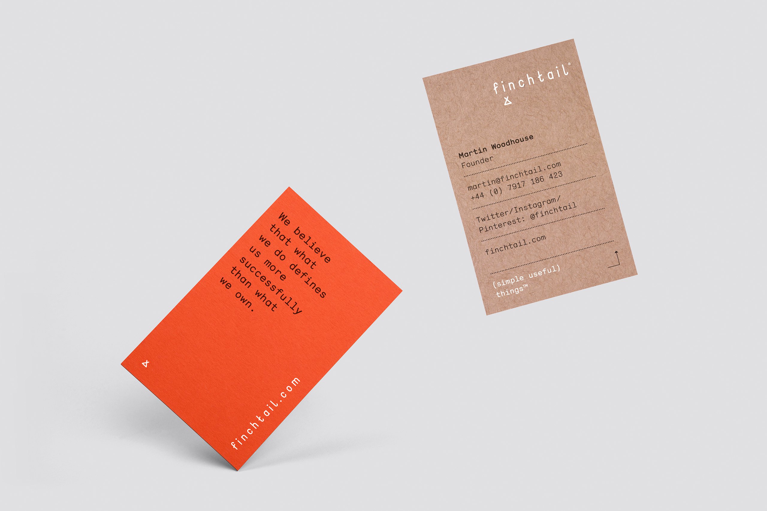
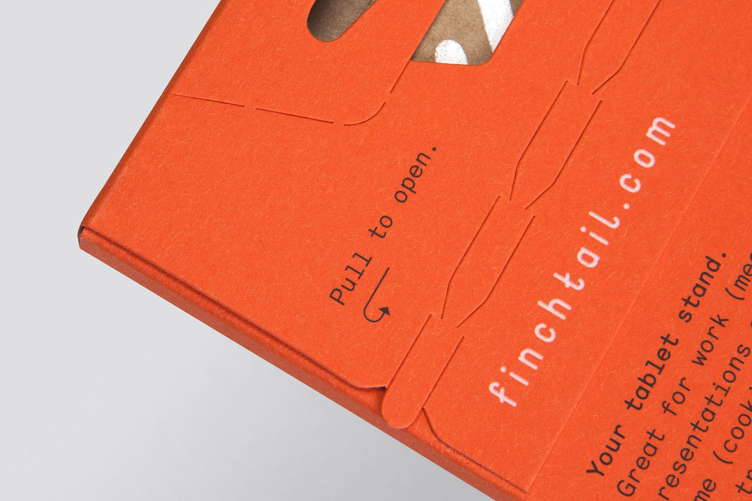
Functional utility with a more human dimension. A (simple useful) brand that celebrates the things we do, not the things we own. Clever, not precious. We sought to explore this juxtaposition through the careful interplay of language, design, print and materials.
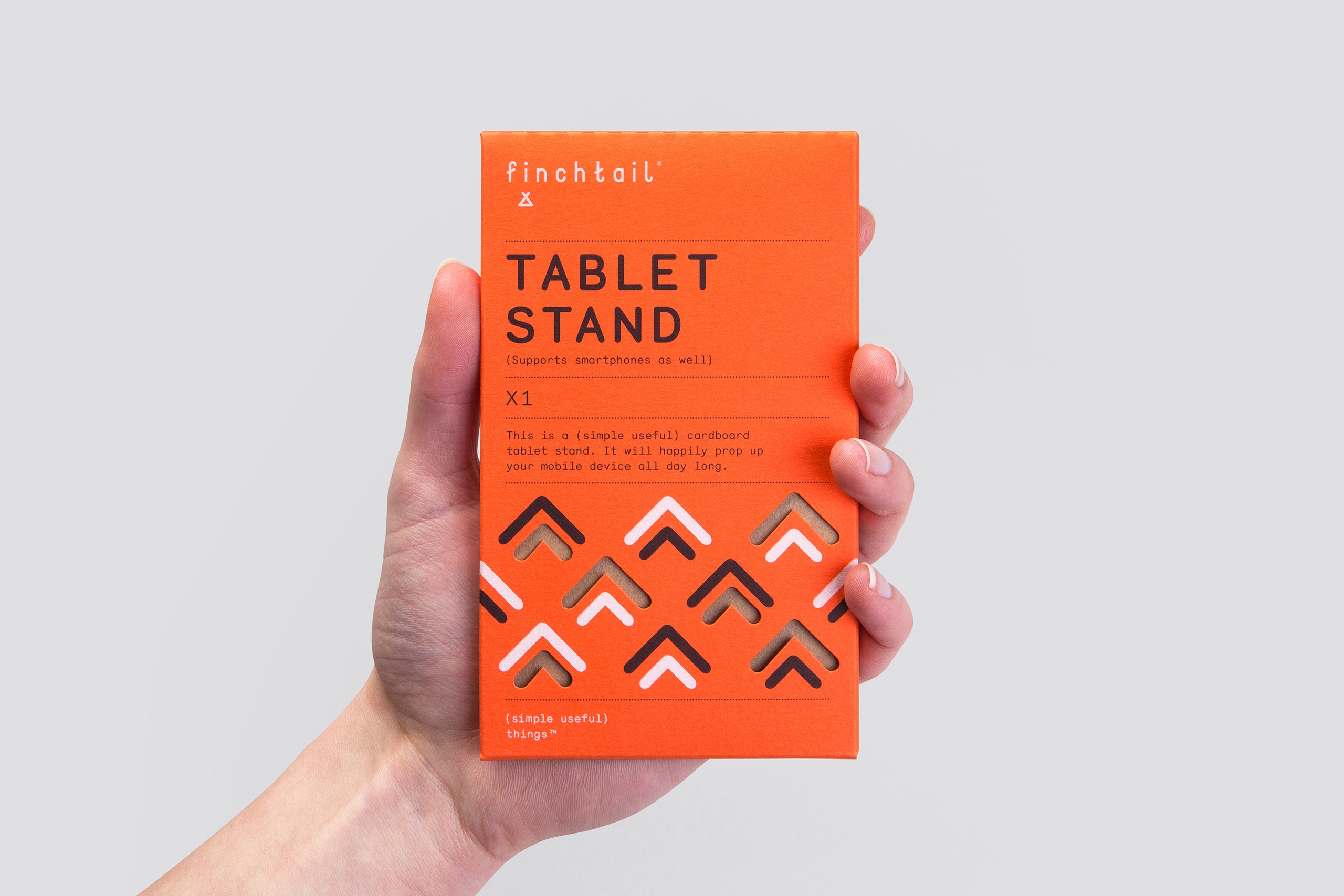
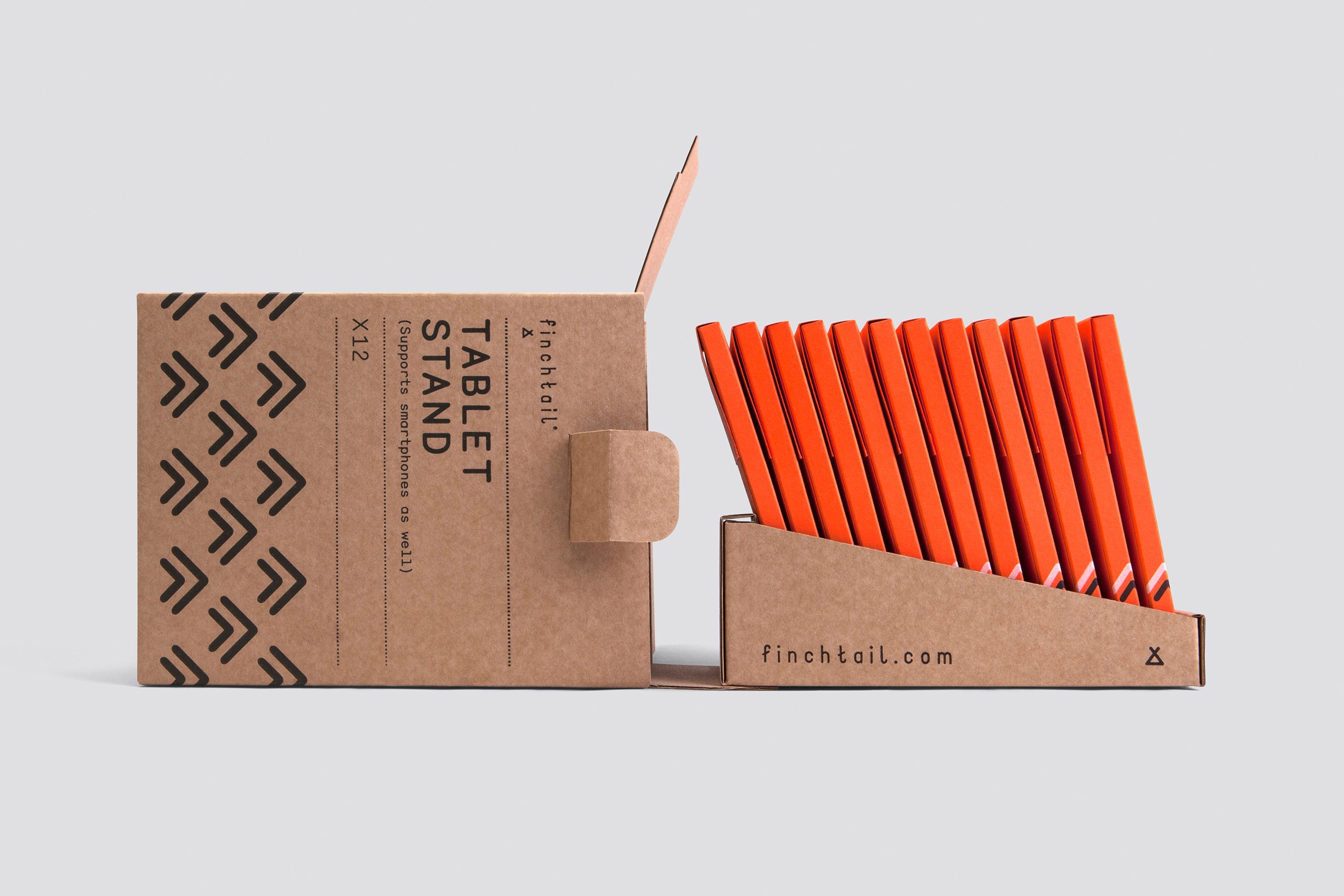
Every aspect of the brand reflects the strategy, delivered with precision and purpose. The marque is inspired by the tablet stand itself, while also connecting to ideas of travel, adventure and social living. Packaging is deliberately limited to black and white inks, while bright orange stock (inspired by the Finch's plumage) plays beautifully with the neutrality of the kraft board, leveraging distinctiveness and colour association. Language stays focused on being informative and helpful, while always conveying a sense of humanity.
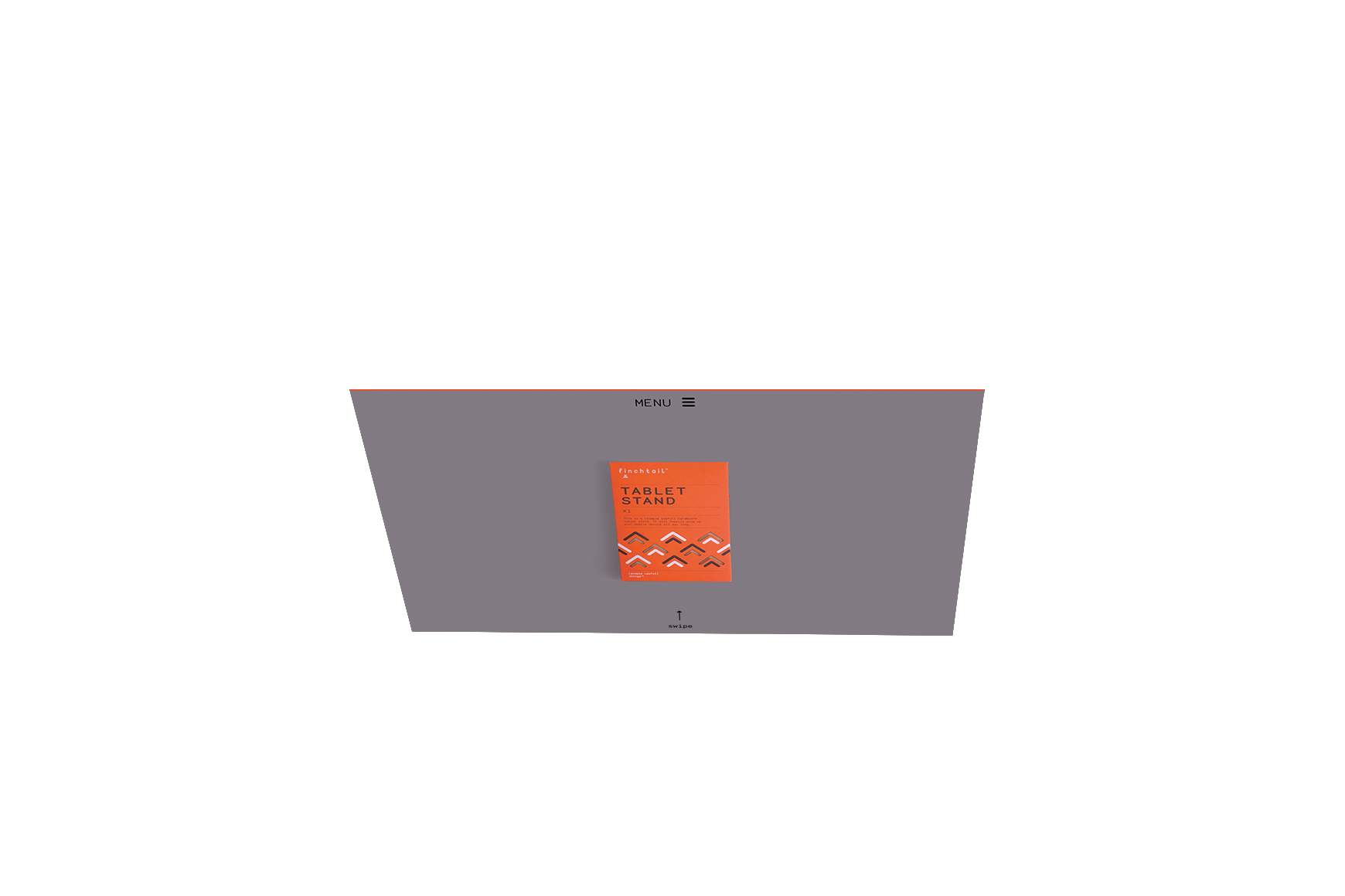
In addition to the brand and packaging, we also created the marketing materials, including a (simple useful) website and launch video. Finchtail attracted immediate interest from a global travel company, plus a listing in the Design Museum's shop (with an initial order that sold out in days).
Disciplines
- Strategy
- Identity
- Packaging
- Web design
- Digital development
- Copywriting