Brief
A special commemorative product to mark the opening of our second studio.
Solution
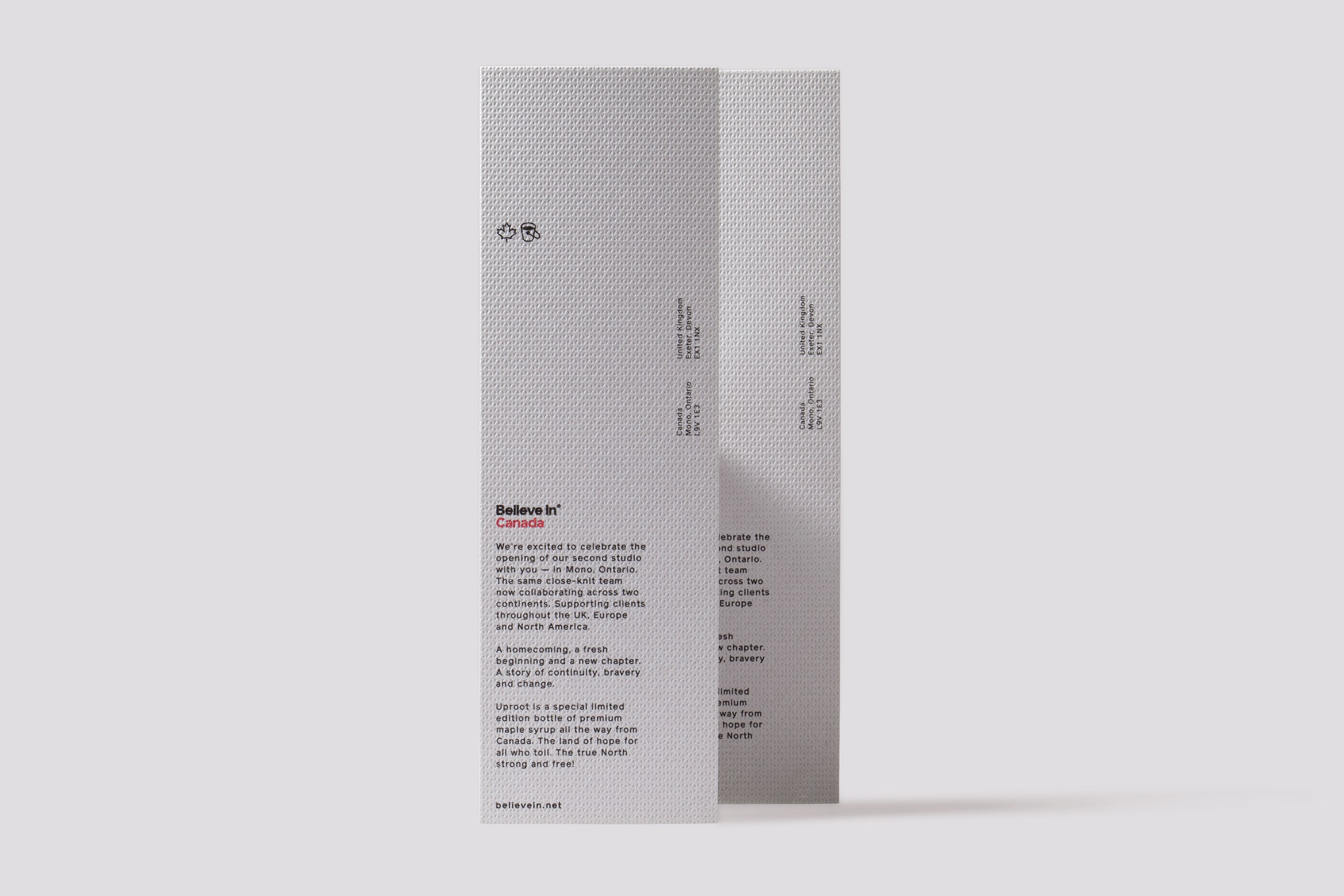
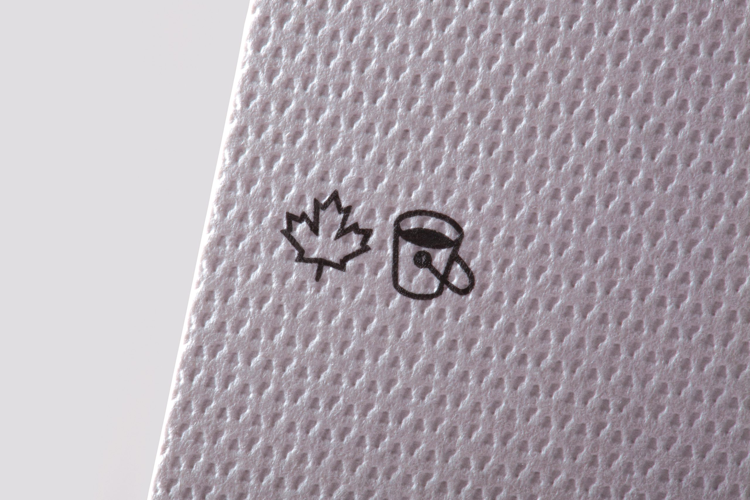
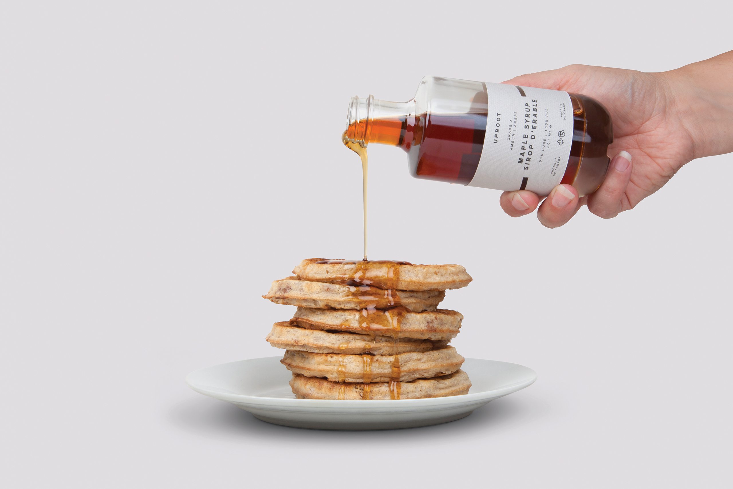
A luxurious limited edition bottle of maple syrup. Uproot takes a Canadian icon and adds a European design sensibility. The name reflects our arrival in Canada while also referencing the process of drawing water up through the maple tree to create the sap from which the syrup is made. The diagonal line on the label represents the geographic connection between Exeter in South West England and Mono in Ontario (just north of Toronto), our two studio locations.
To reinforce the sense of luxury, heavyweight glass bottles were sourced from Italy, while the labels were created using Takeo Tassel, a subtly embossed light grey paper from Japan. A heavier weight of the same paper was used for the accompanying card. 200 bottles were produced in total, each one individually numbered.
Special thanks to:
G.F Smith — Paper
With Print — Print
Disciplines
- Research
- Naming
- Identity
- Copywriting
- Packaging
Project images