Brief
Since 1974, Mantracourt Electronics has quietly defined what reliable innovation looks like in the sensor industry. Trusted by engineers and system integrators around the world, they’ve built a reputation not on noise, but on results — delivering the expertise, products, and support that make sensor technology work.
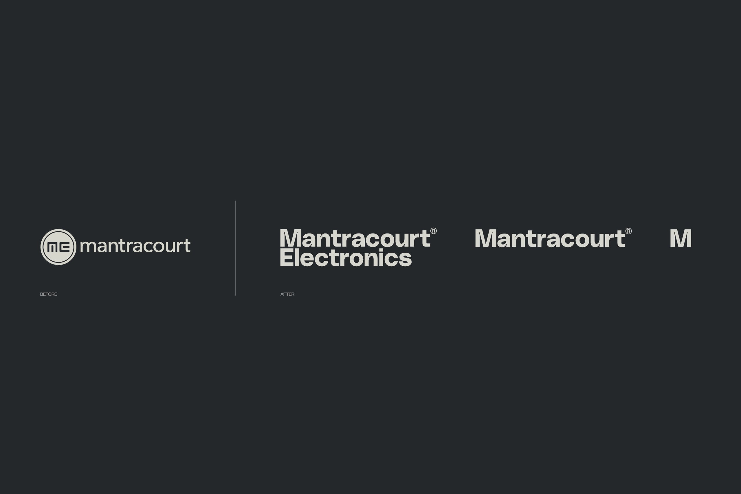
The brand needed a new visual language to align with these facts. One that would boldly identify them as leaders in their field; an aspirational shift to fire internal change, and carve a new path within the industry whose static face often falls short of its progressive nature.
Solution
In the world of industrial electronics, it’s easy to focus on the technology itself: the circuits, the sensors, the data. But behind every great sensor solution is a team of engineers, solving real-world problems with precision, creativity, and persistence.
Together, we set out to craft an identity that feels as confident and exacting as the engineering behind their products, but also human, open, and modern. A system that communicates with clarity and purpose, reflecting a company built on proven innovation and genuine collaboration.
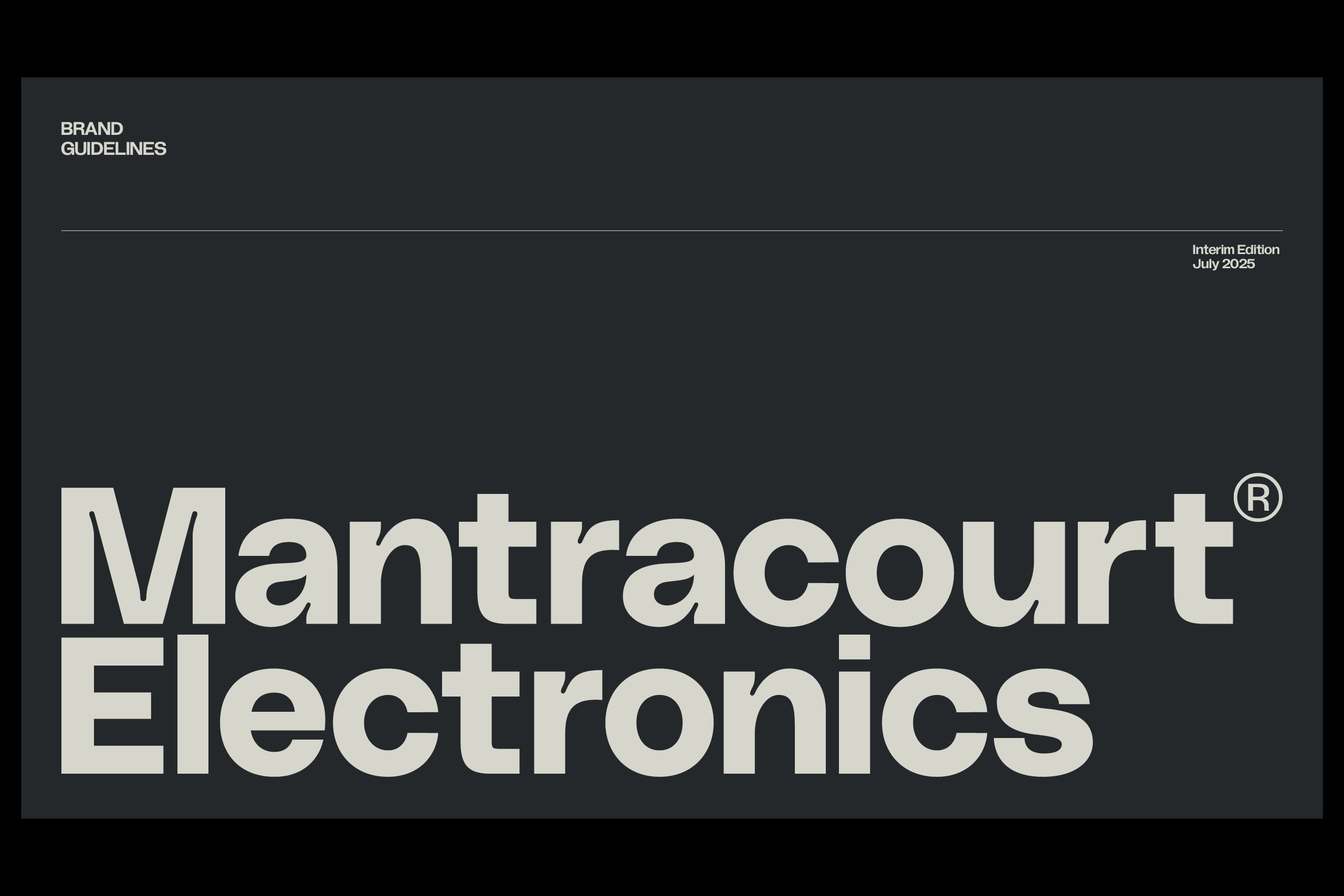
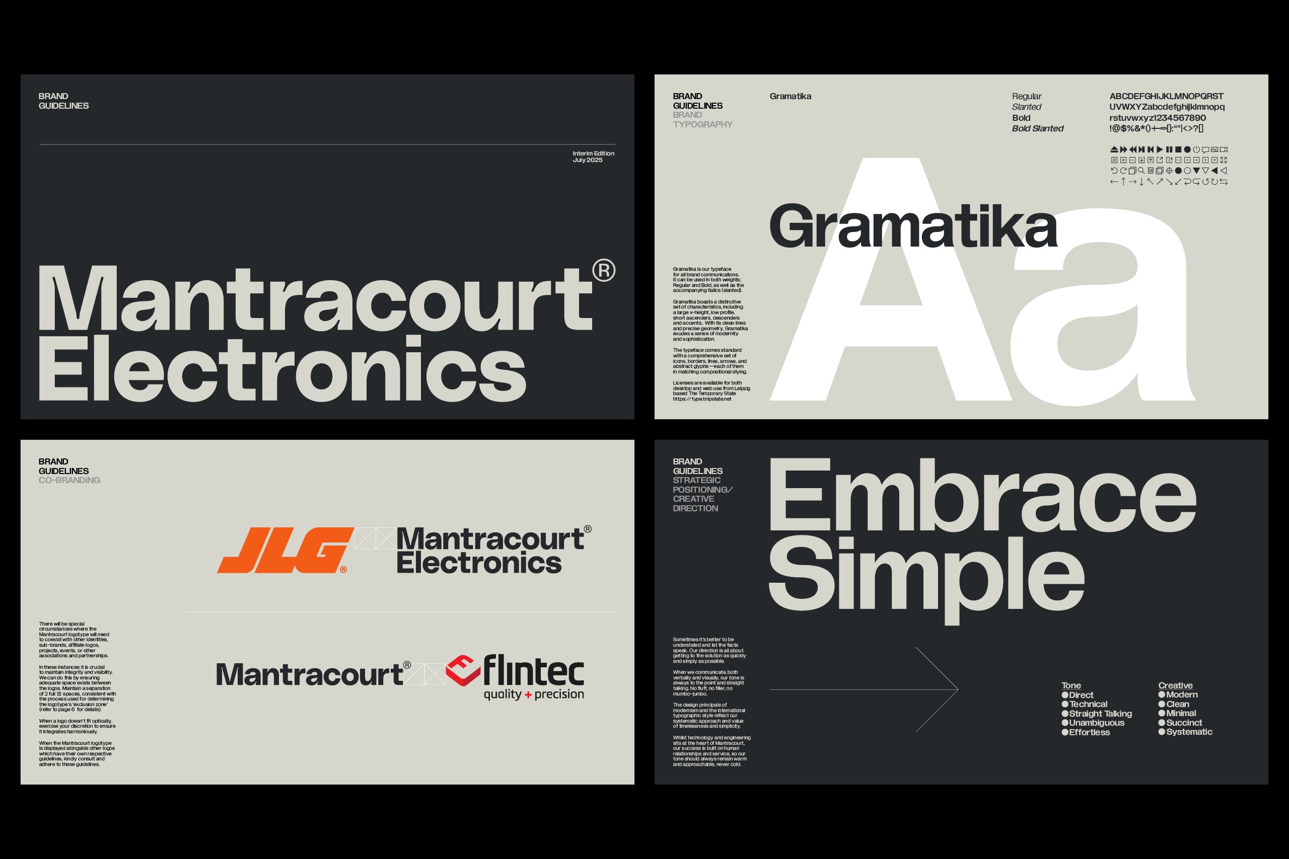
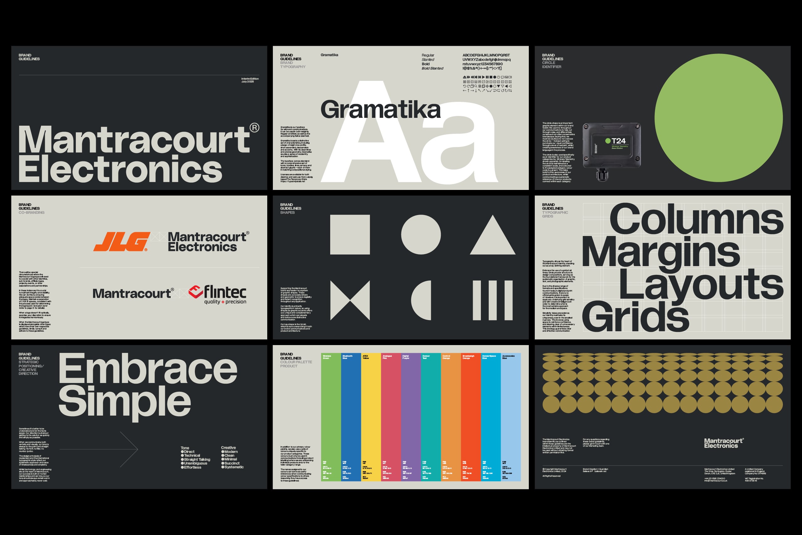
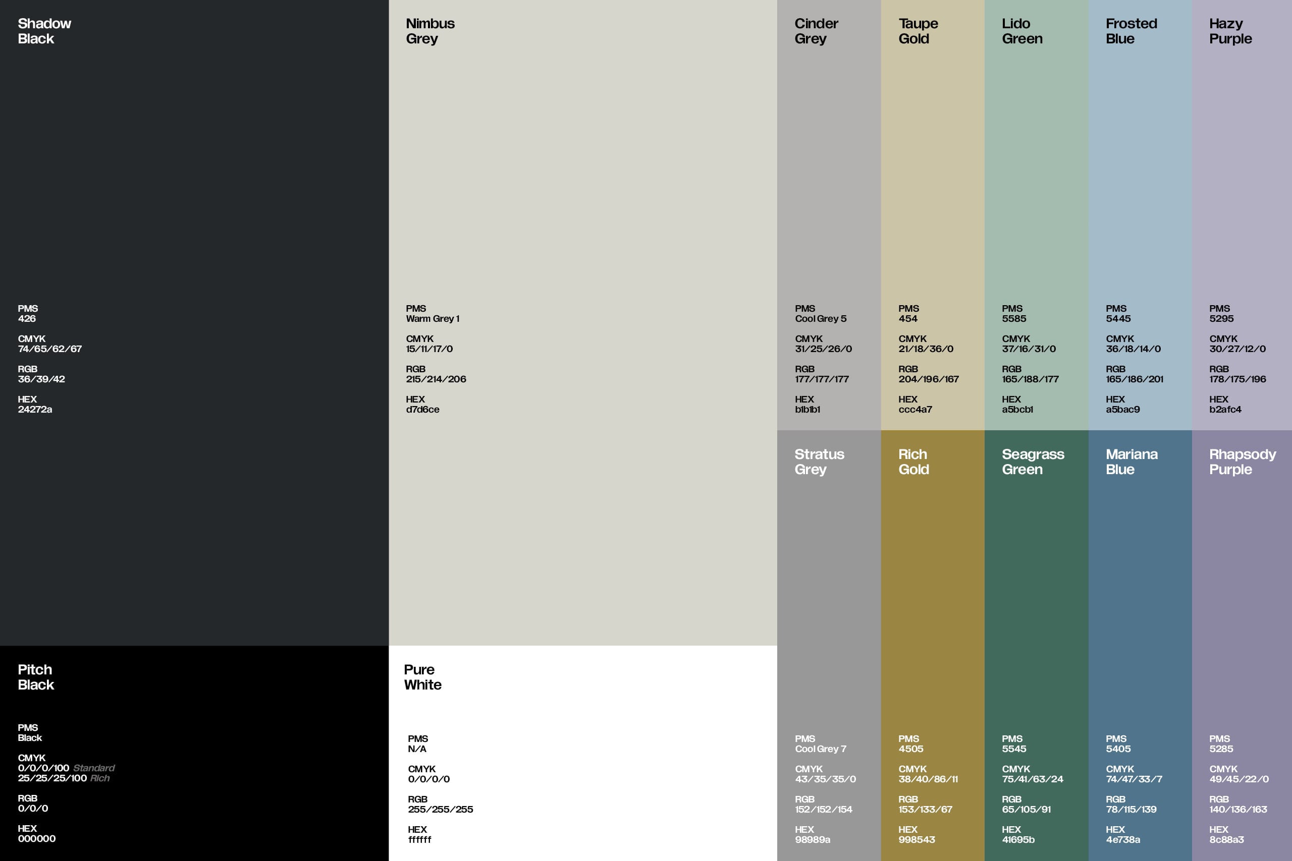
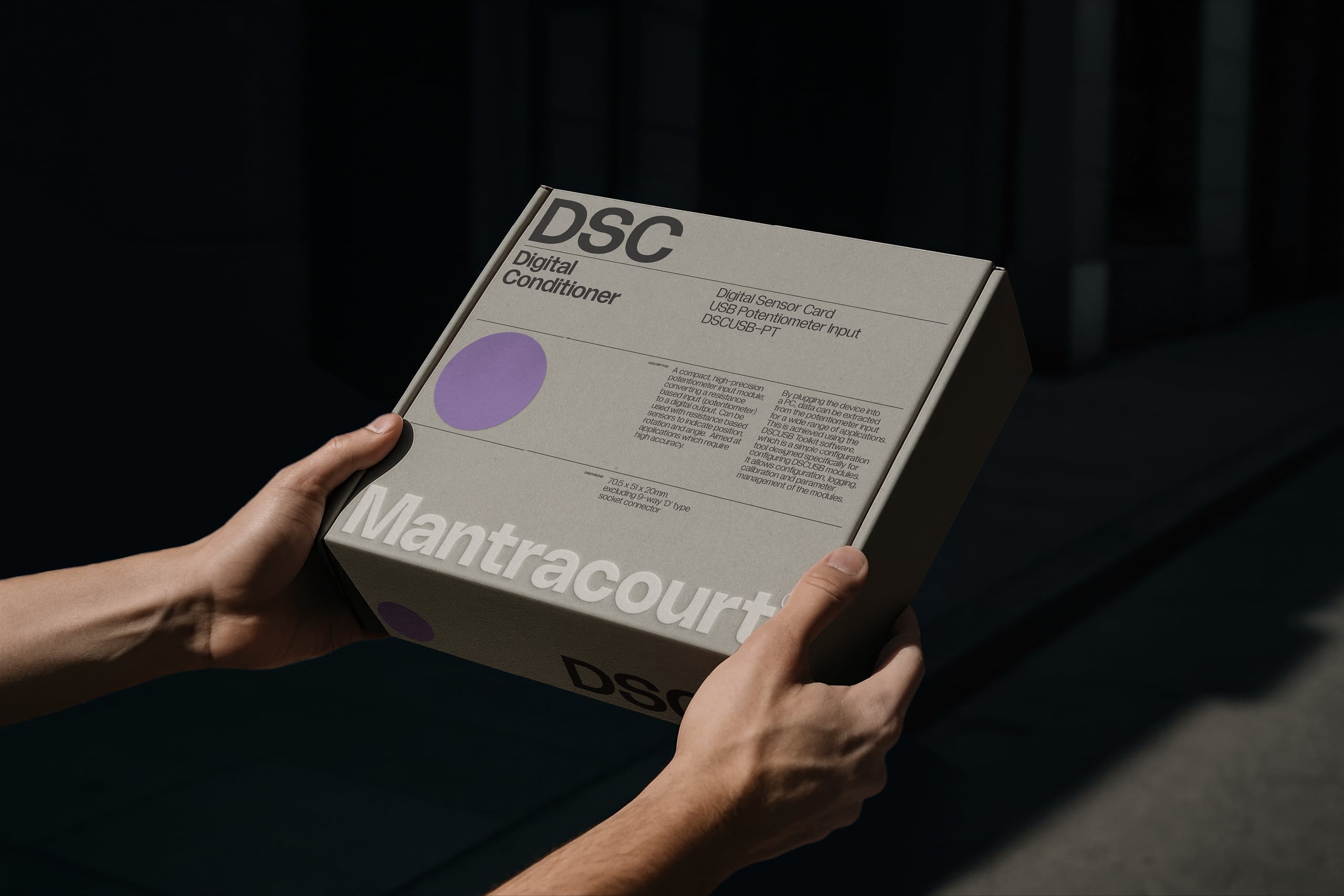
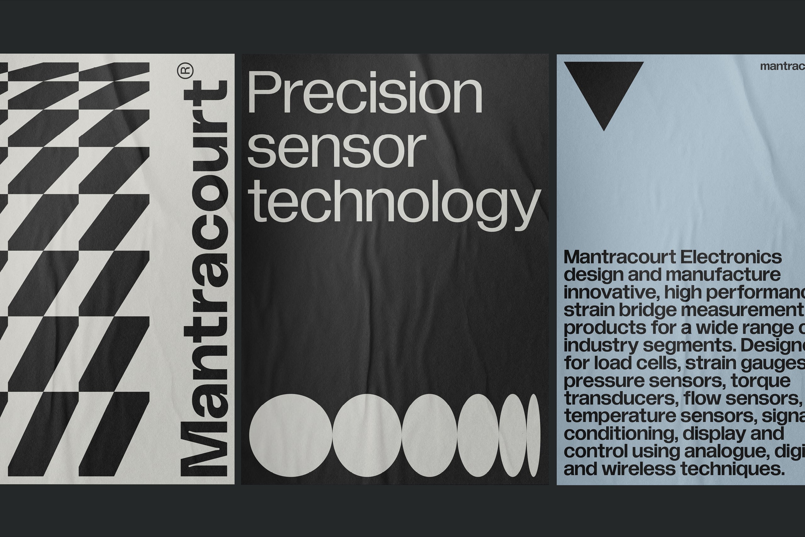
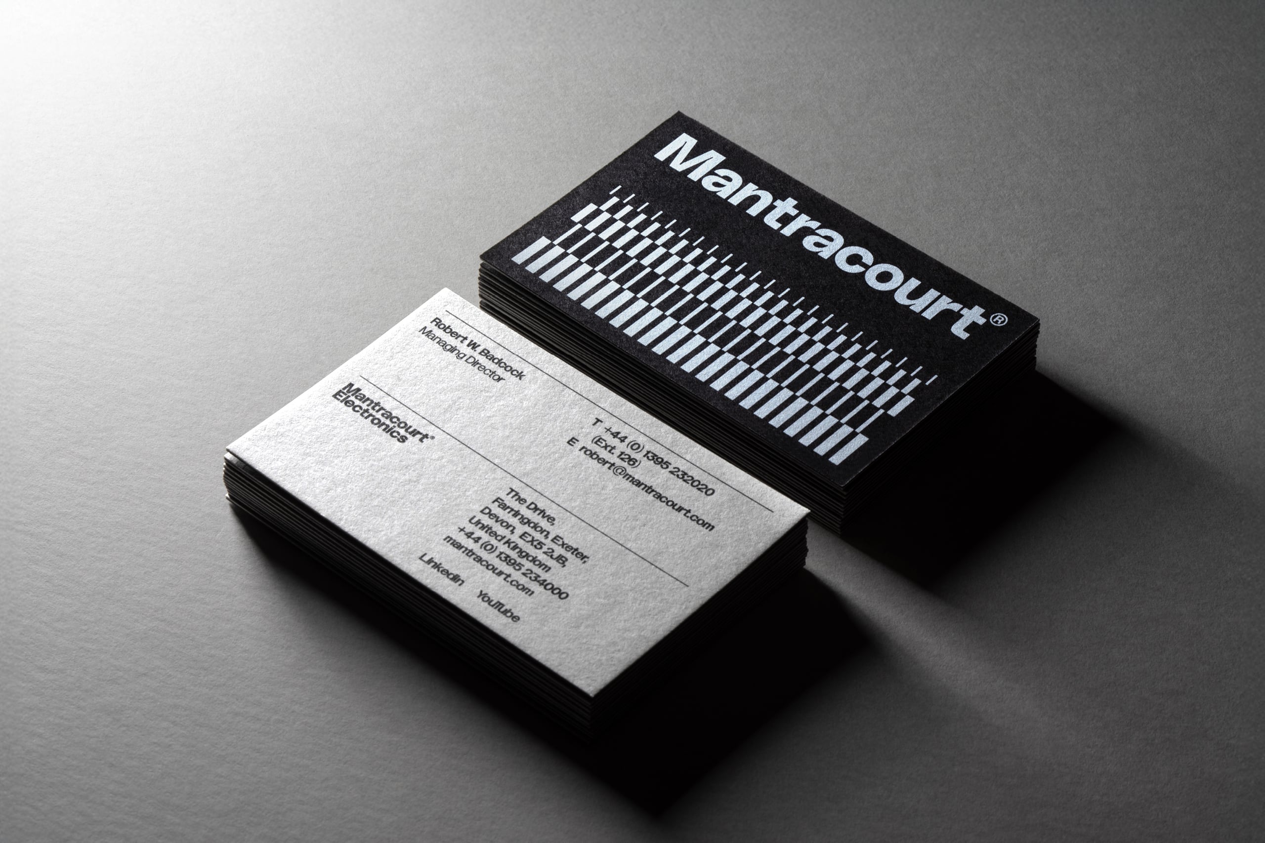
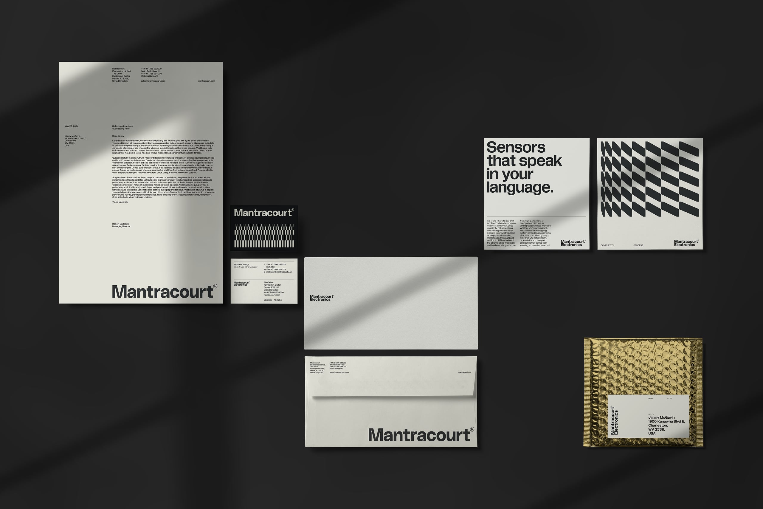
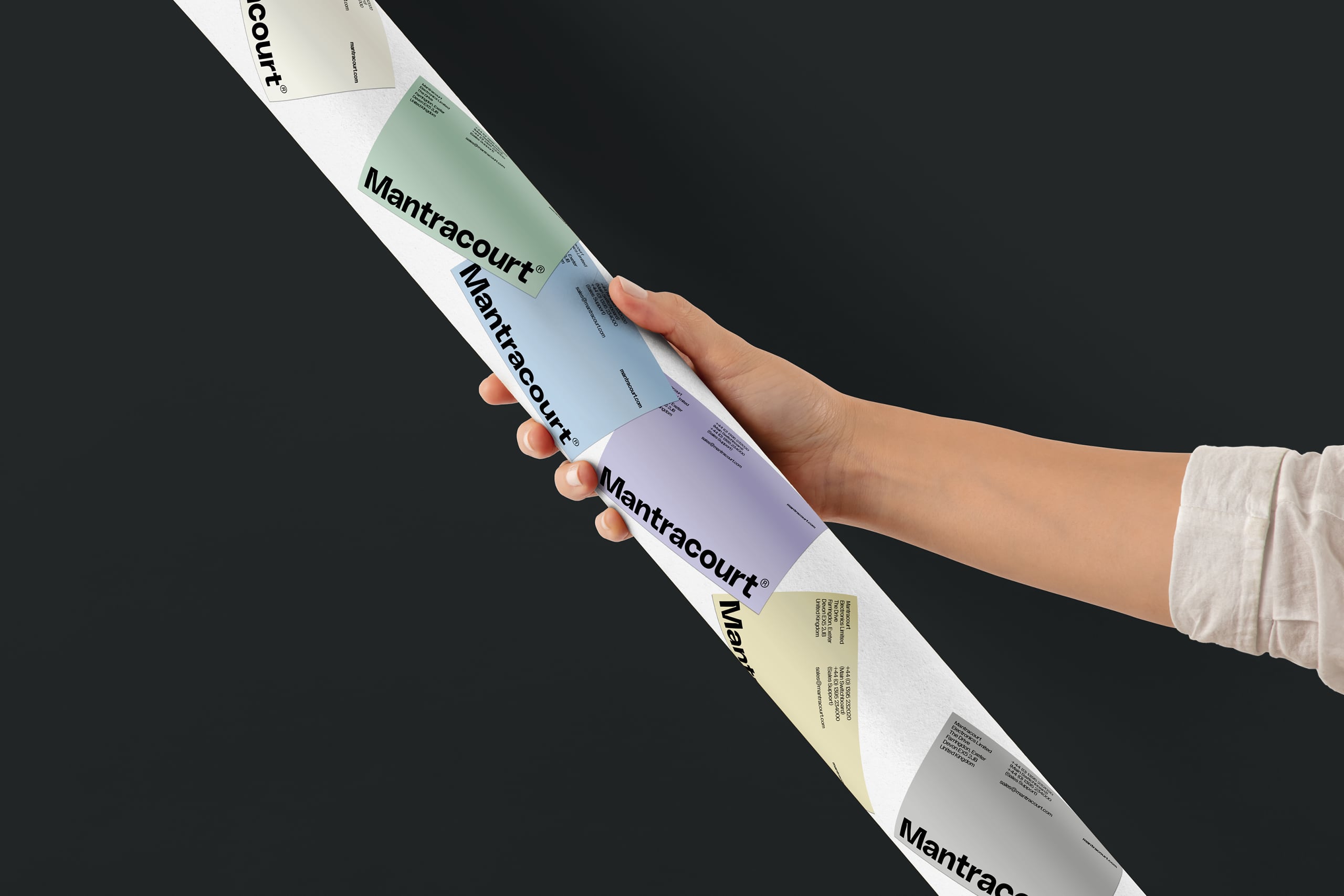
We created a bold and expressive wordmark, using the exaggerated inktraps of Gradient's PolySans Bulky to convey a sense of craft and meticulous attention to detail — but with a soft fluidity that hints at the soldering and traces on a printed circuit board.
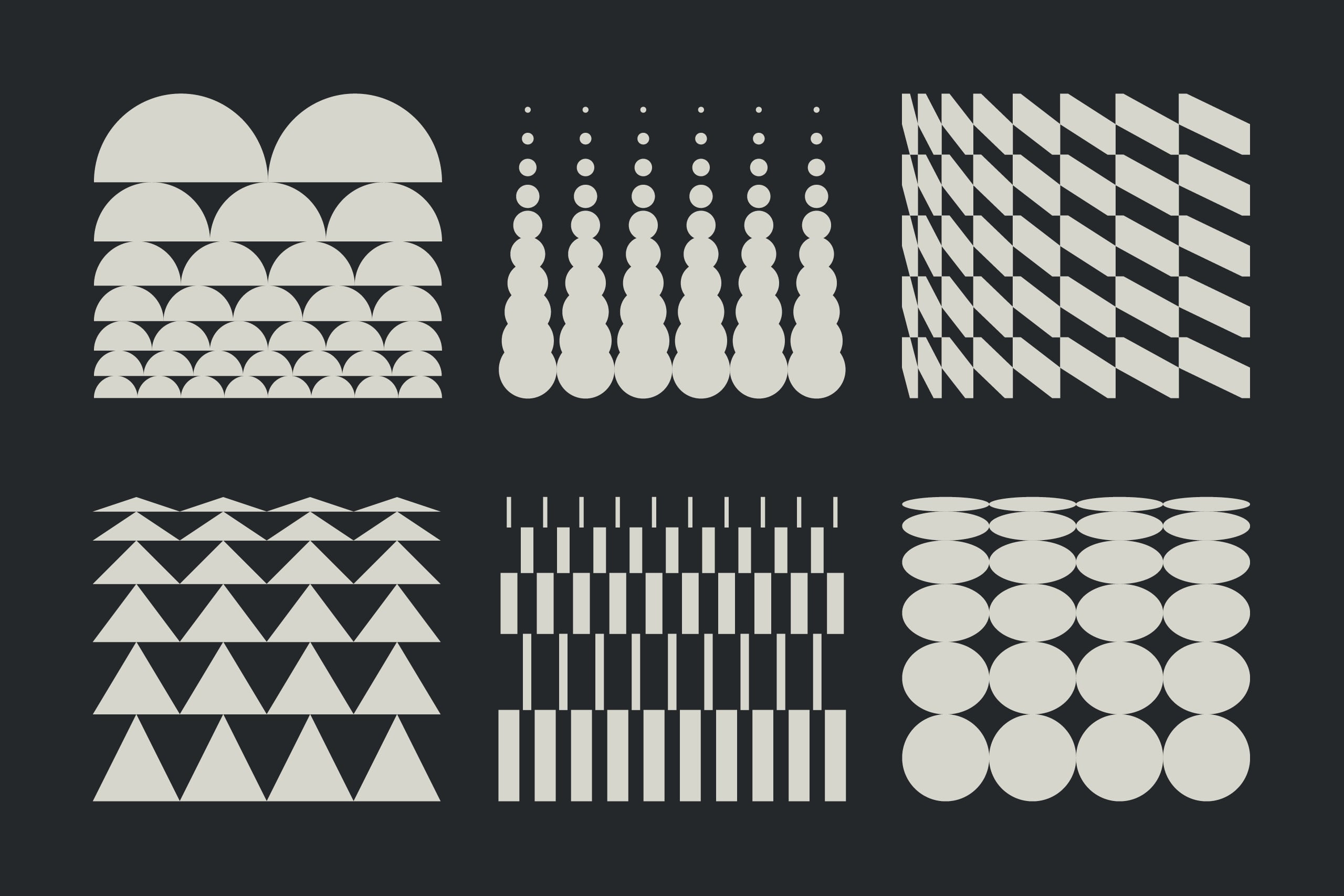
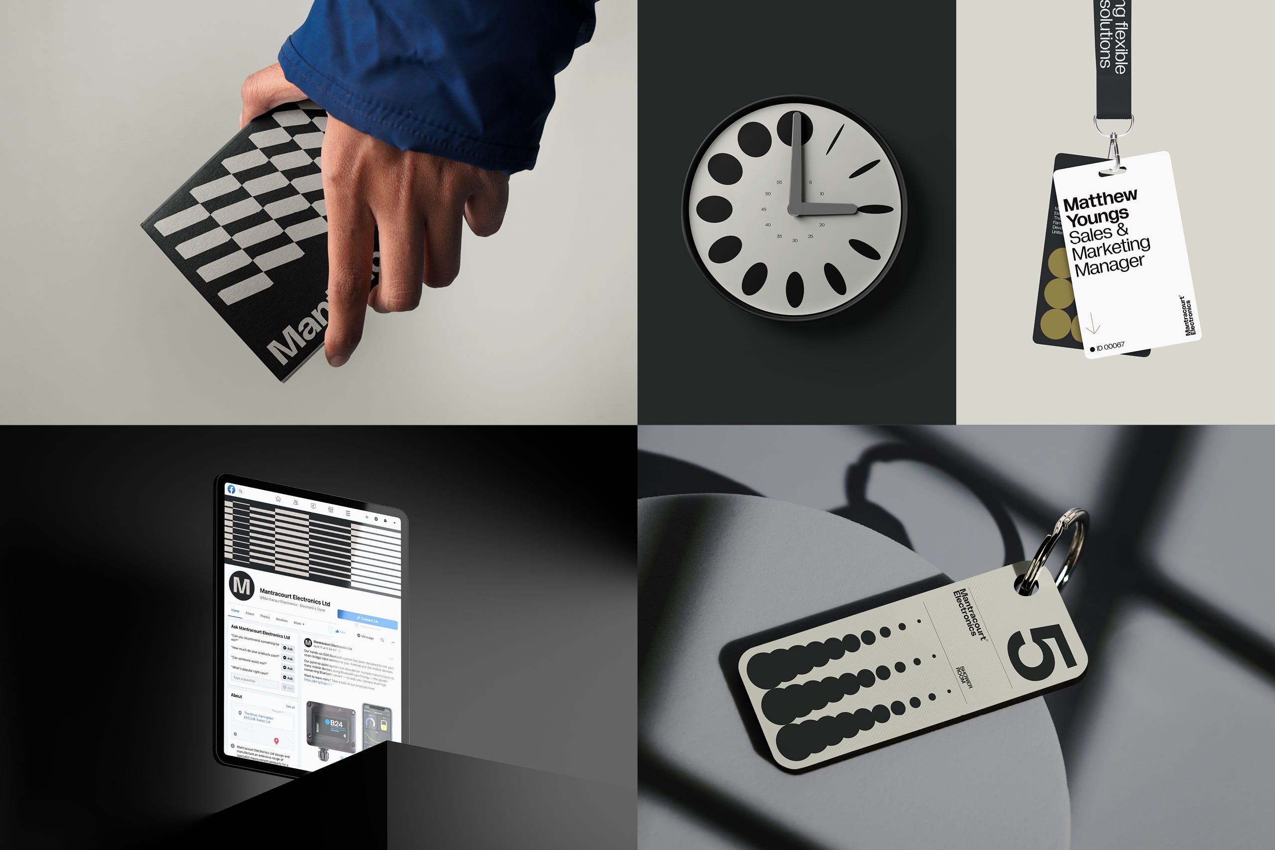
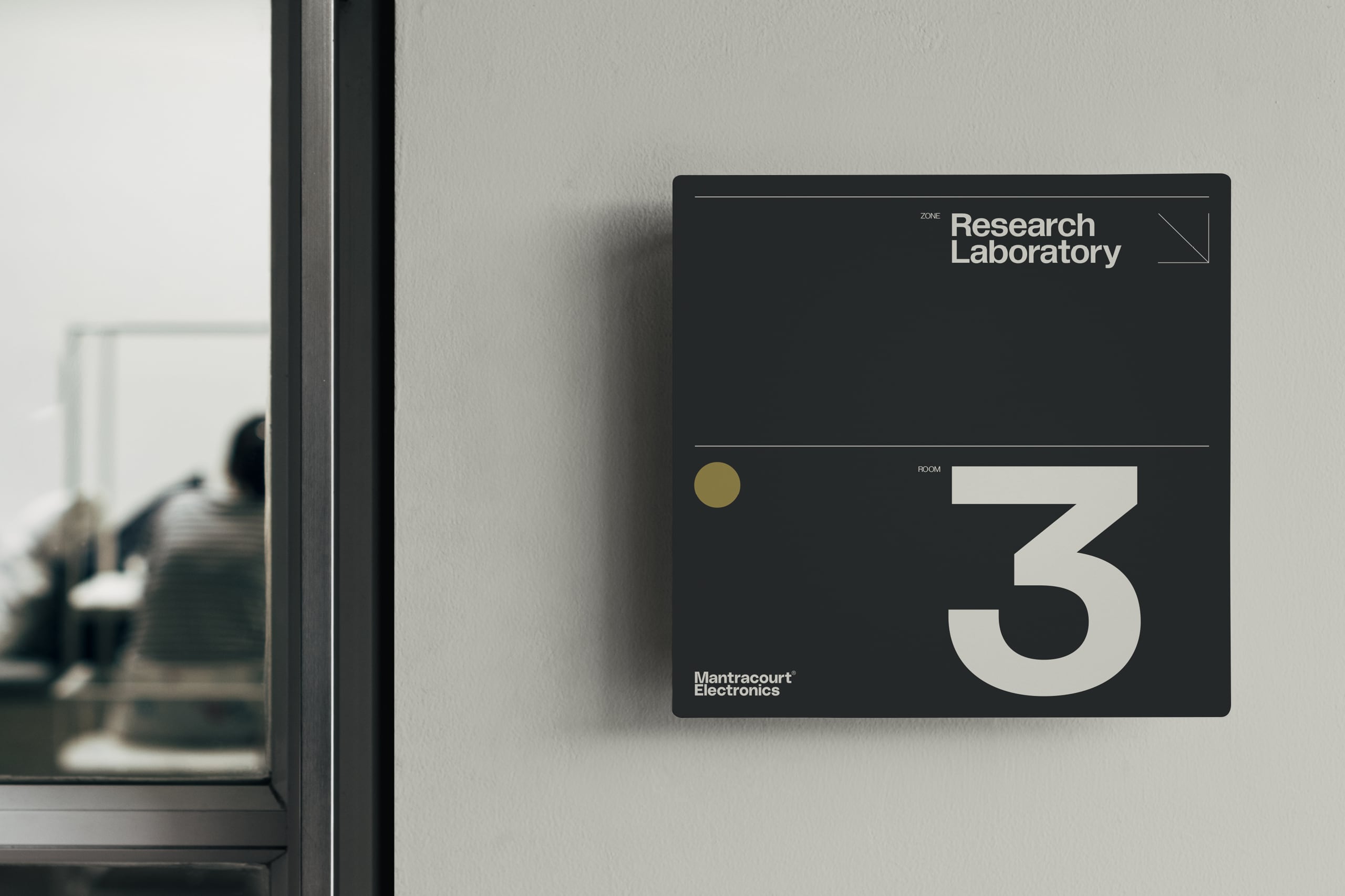
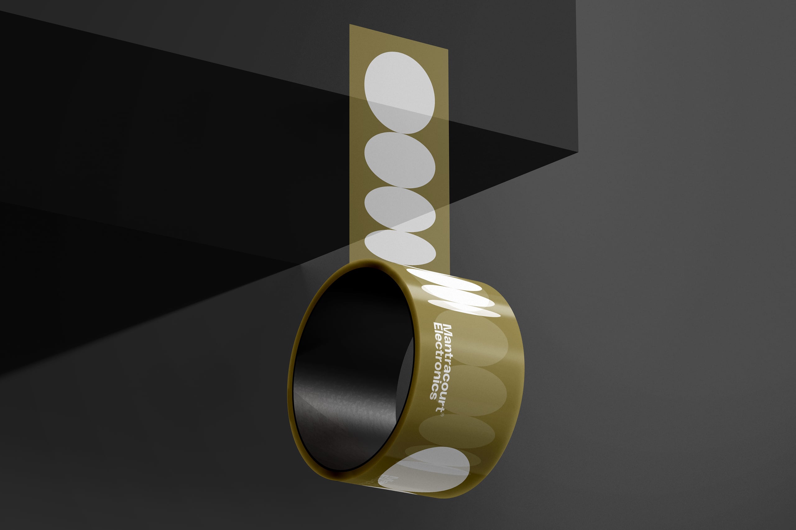
A set of geometric shapes references components coming together as a system, and can evolve into more creative expressions of data output through varying transformations of repetition, scale, expansion and contraction. The result is a flexible and dynamic range of graphic elements, reflecting the diverse applications of Mantracourt's products.
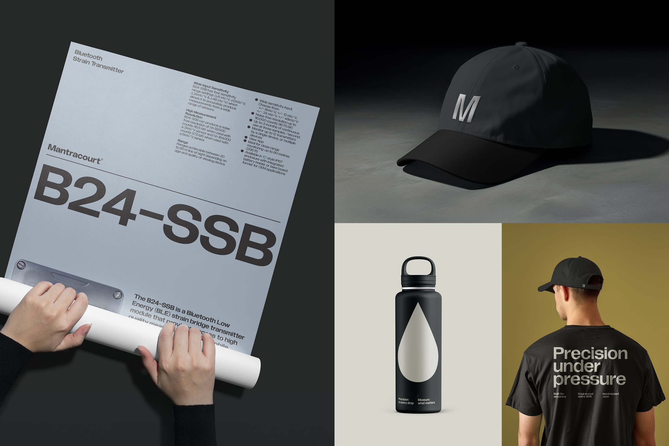
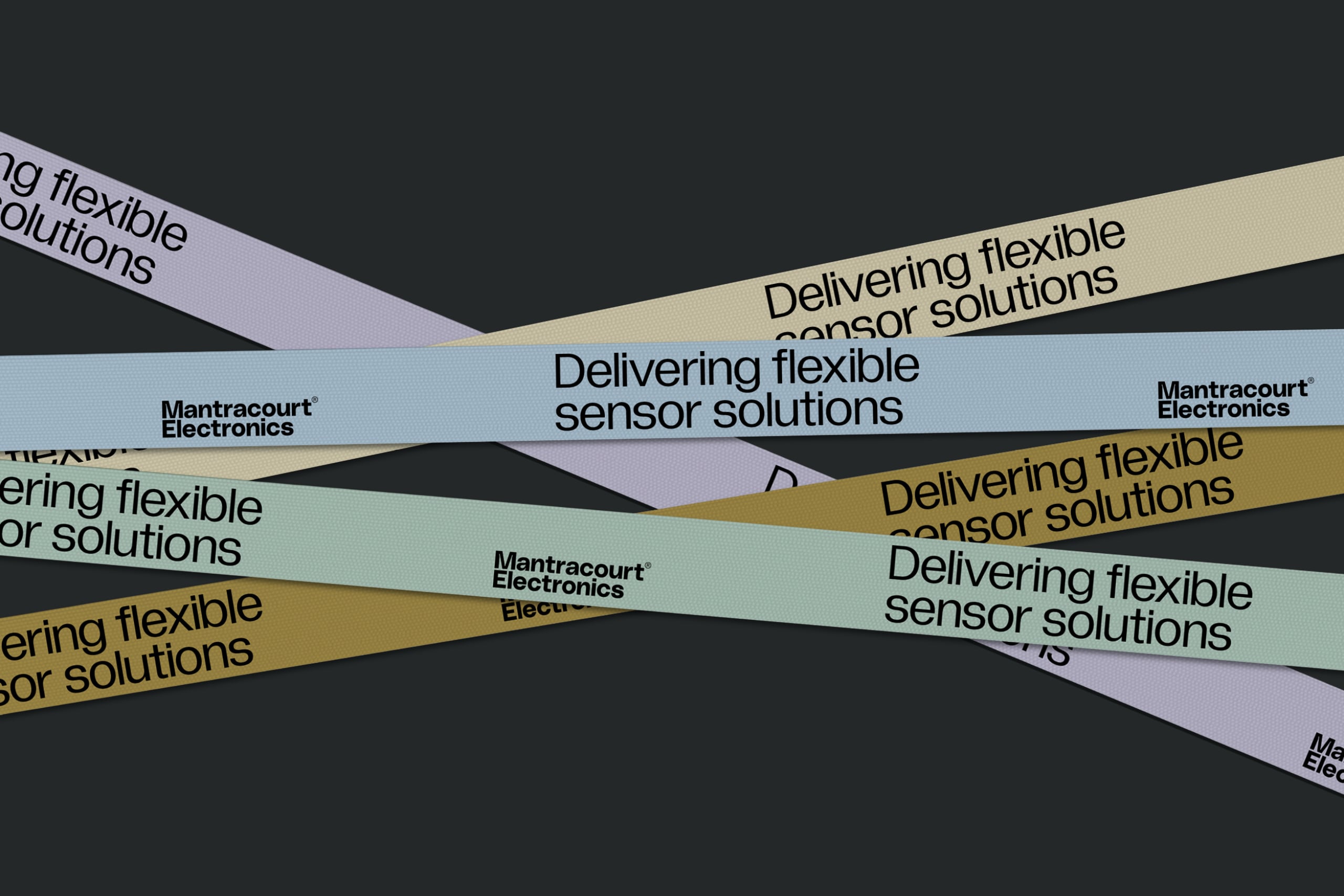
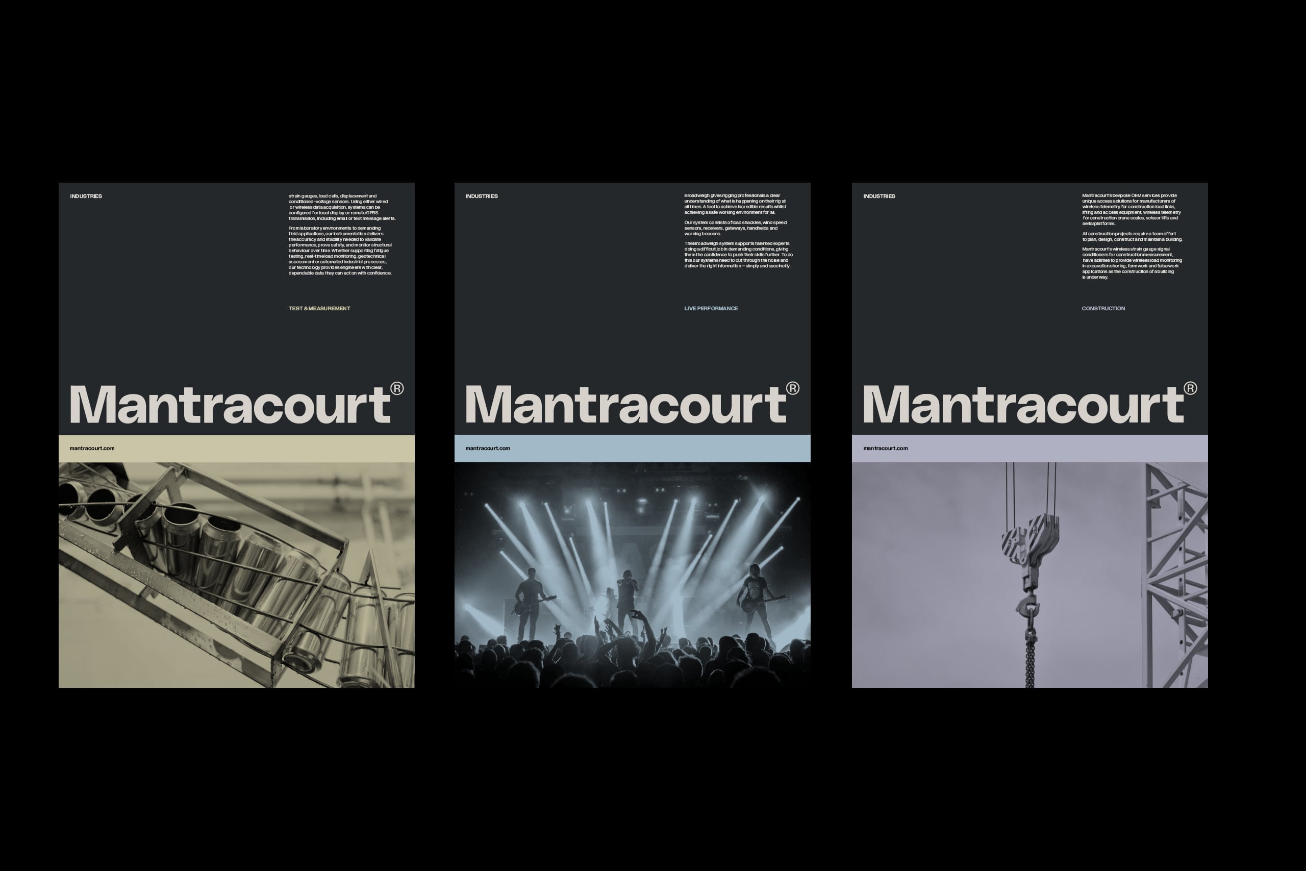
We shifted the visual and verbal narrative towards storytelling and human relationships over purely product, embedding unexpected and engaging elements to build a warm, approachable personality while remaining functional and efficient. A delicate balance of the objective and technical, with the human and emotive.
Brand Strategy: Matt Brown
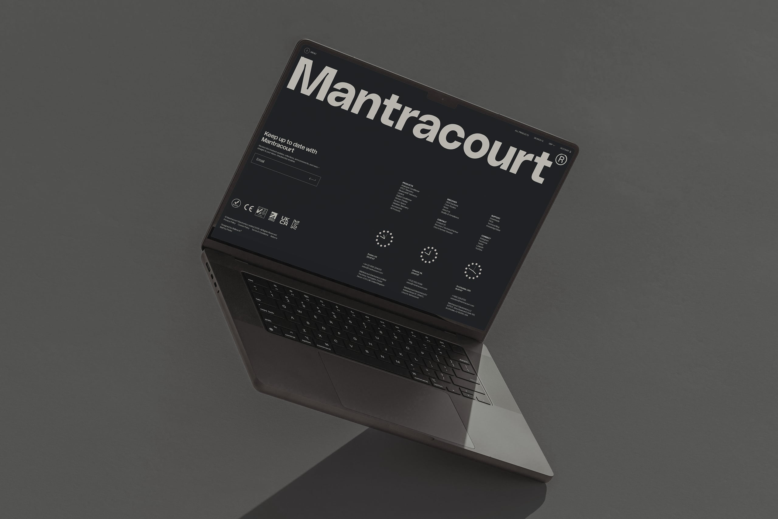
Digital Development Partner: Fhoke
Type: PolySans, Gradient + Gramatika, The Temporary State
Disciplines
- Research
- Strategy
- Identity
- Copywriting
- Illustration
- Marketing Comms
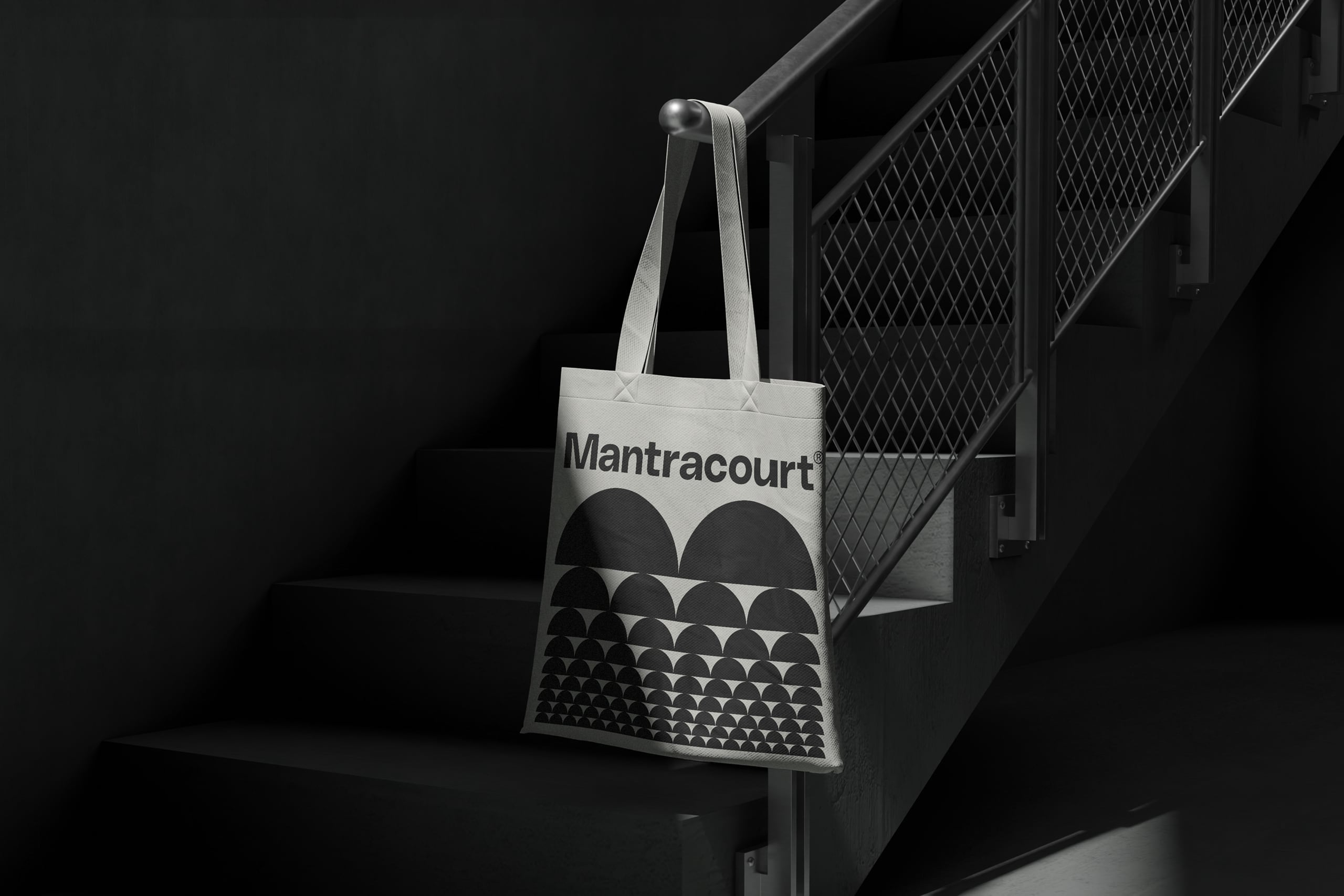
- Merchandise
- Uniforms
- Display
- Digital Development