Brief
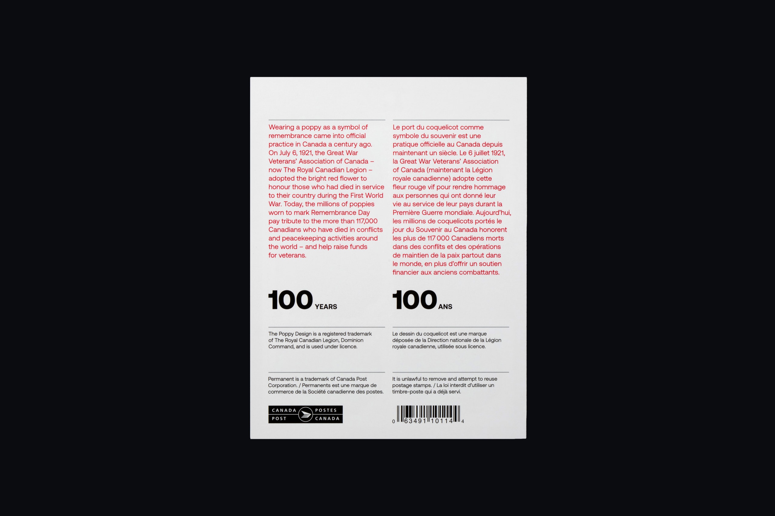
Working with our client Canada Post, we were invited to develop stamp designs to commemorate the 100th anniversary of the official adoption of the poppy as a symbol of remembrance in Canada, released to coincide with the launch of The Royal Canadian Legion’s 2021 National Poppy Campaign.
Solution
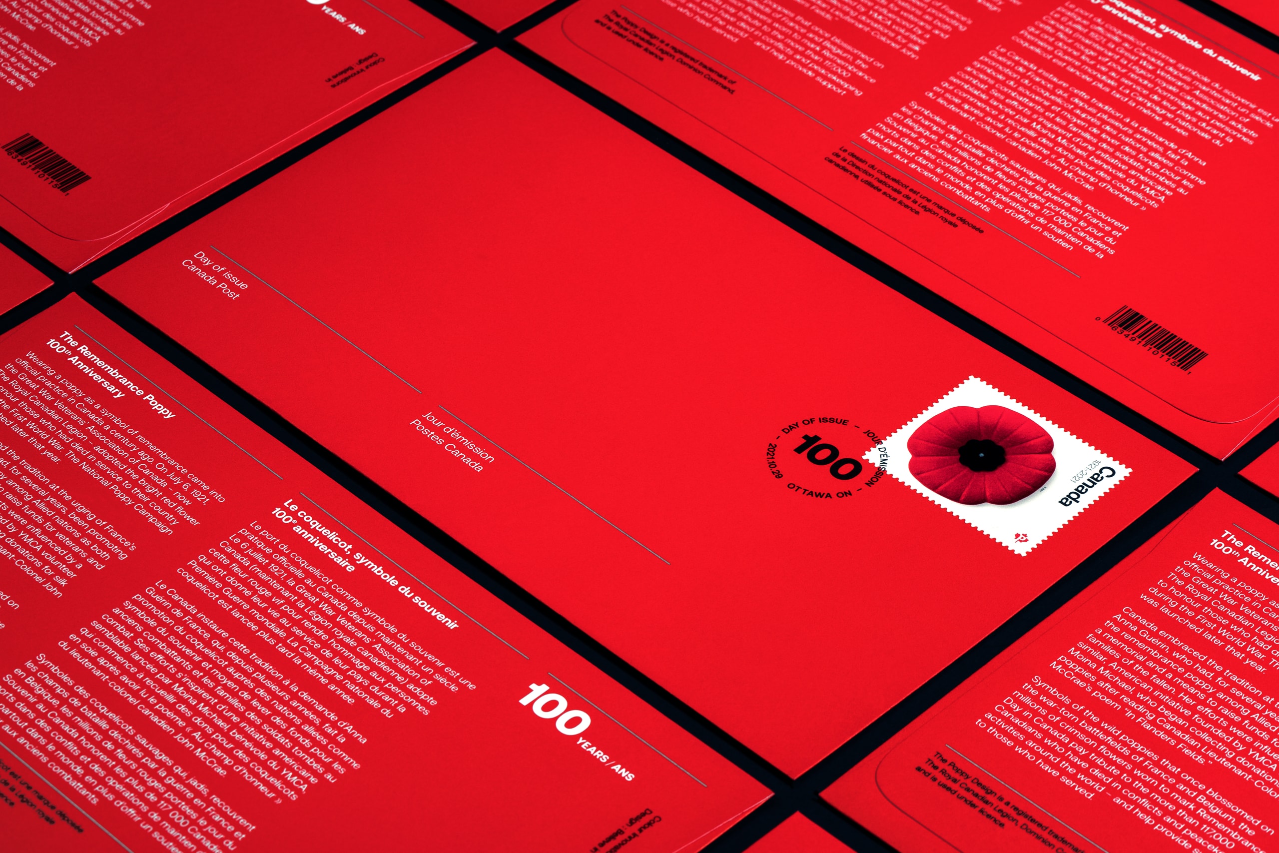
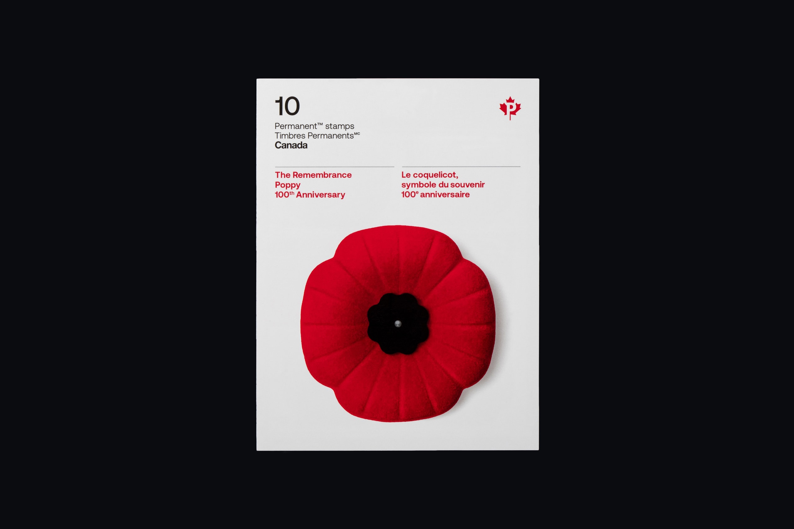
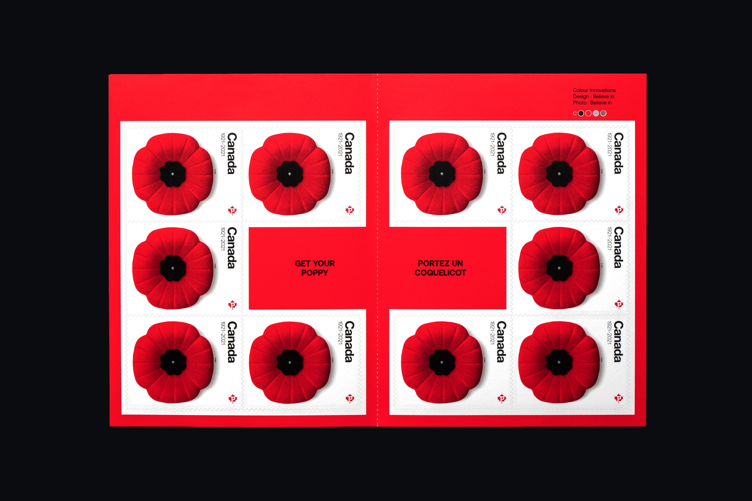
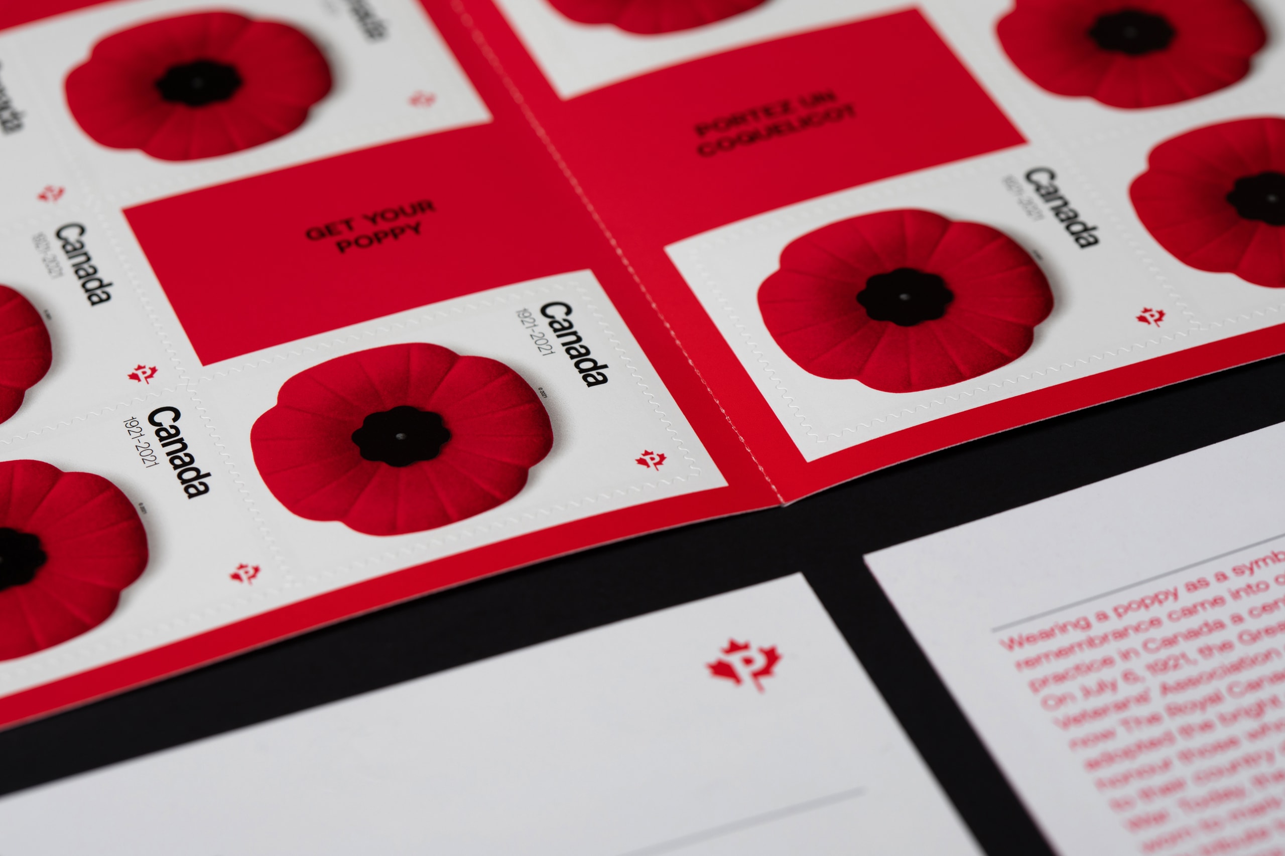
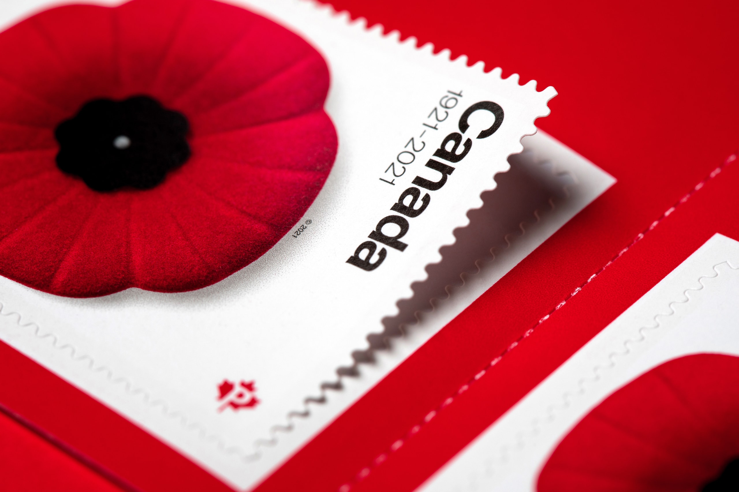
Because this release focuses on immortalizing the poppy itself, and the honourable role it has played in Canada for a century, our solution intentionally places its entire focus on the Poppy's symbolic nature. We stripped away all that was unnecessary, and focused on the purest form of visual clarity. We imagined letters and parcels, literally wearing their own poppy. Photography was undertaken and art directed in our dedicated studio.
With the careful help of Colour Innovations (printer), we custom-mixed a special ink to create an almost fluorescent red that, when printed, would accurately match the vibrancy of The Royal Canadian Legion poppy. The white background of the stamp itself allows the flower maximum contrast, while metallic silver ink adds realism to the head of the pin, and is further used for details on the official first day cover. The classic Canada wordmark, seen on Canadian stamps throughout the 70s through to the mid-80s, is a signature detail that creative director Blair Thomson reintroduces, paying respect to his obsession with the Canada Modern era.
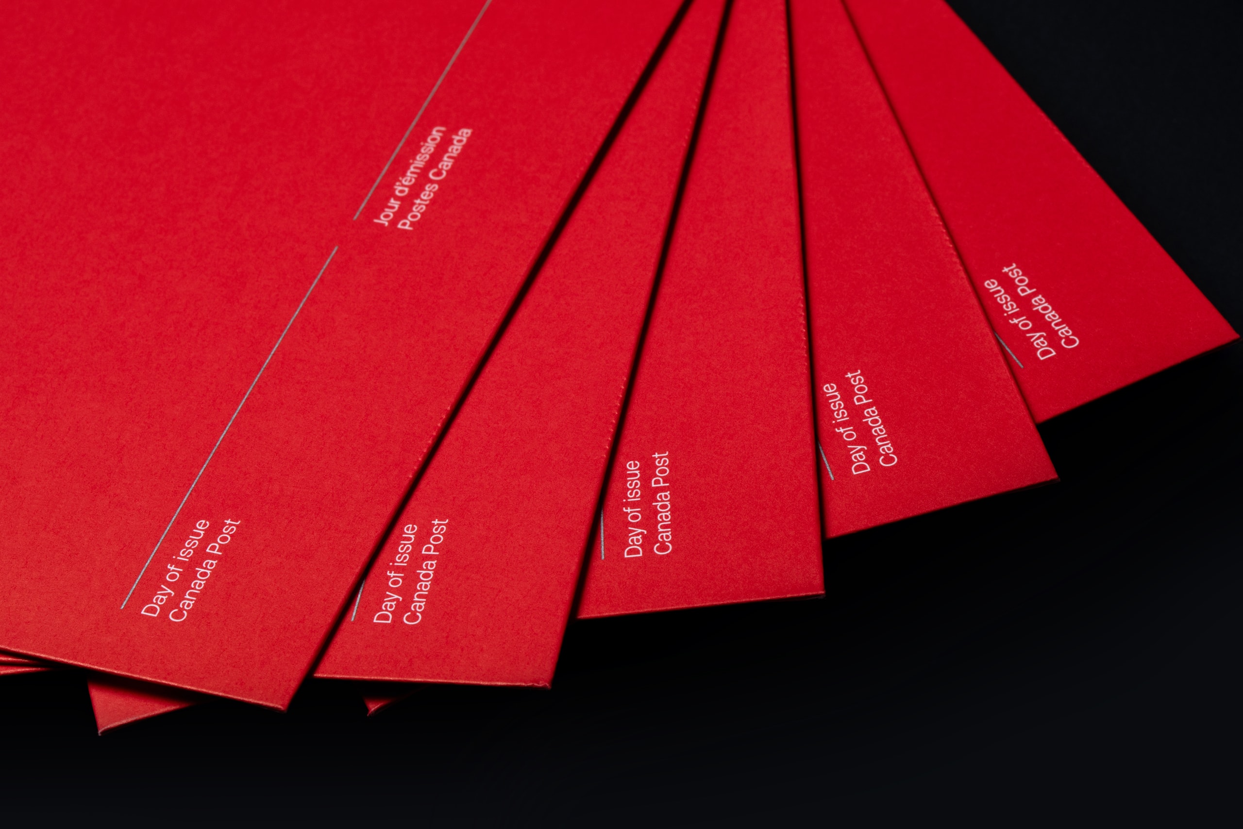
The project comprised of the stamp itself, a booklet of 10 Permanent™ domestic rate stamps and an Official First Day Cover (which includes a cancellation mark).
Both products are available at canadapost.ca and post offices across the country.
Print: Colour Innovations
Type (except Canada wordmark): CoType
Disciplines
- Research
- Graphic Design
- Photography
- Art Direction
- Print Support
Project images