Brief
Brand development for a company building new hyperfast broadband networks in residential developments.
Solution
Brand strategy, name and visual identity plus initial applications ready for launch.
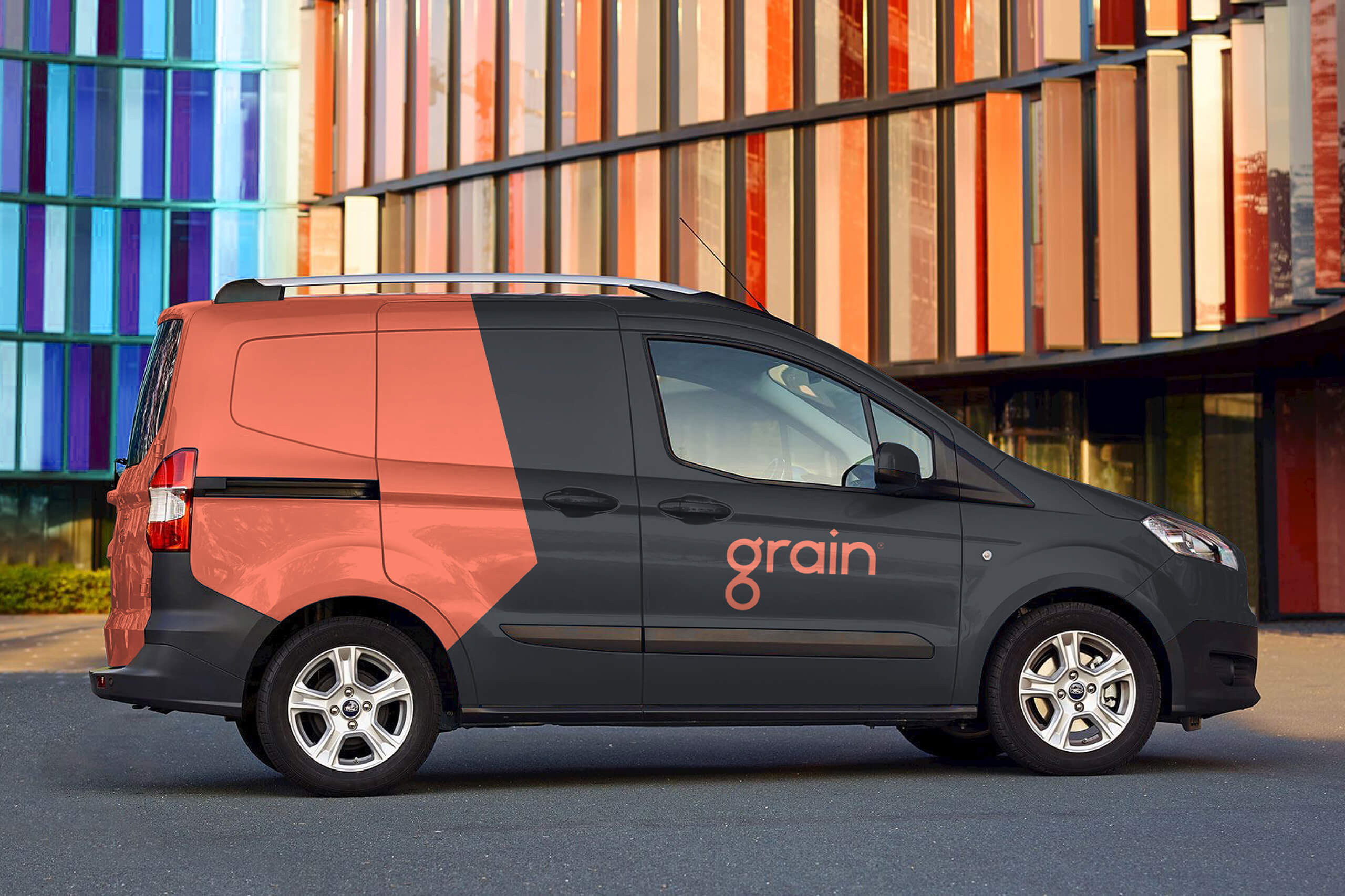
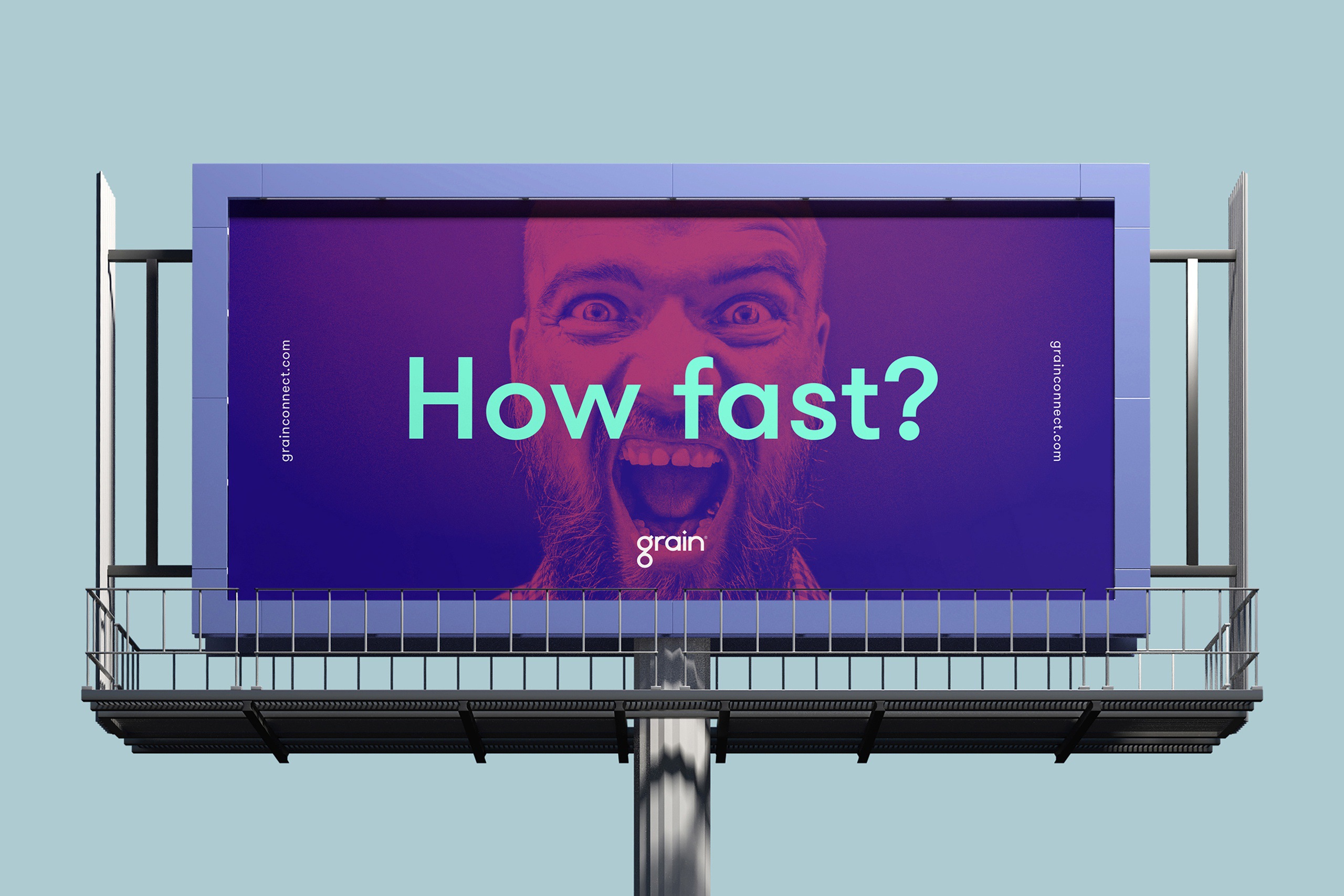
Most broadband brands like to appear fast, employing plenty of speedy graphics to compensate for the lack of oomph in their actual service. A Grain connection, however, is a different order of fast, so rather than playing the competition at their own game, we took a different approach. The strategy reflects the company’s desire to make things simpler and more human, both for the developers they work with and the customers they serve. The name is inspired by the first line in a William Blake poem - “To see a world in a grain of sand”, and we also managed the IP and trademark protection.
The wordmark is designed around a distinctive initial ‘g' that can also work as a standalone icon where space is at a premium. The identity system combines a bold palette with simple shapes to create a dynamic environment for communications, both online and in print. Working with Hungry Sandwich Club we developed a series of animations to bring the service to life.
Character illustration & animation: Hungry Sandwich Club
Disciplines
- Research
- Strategy
- Naming
- Identity
- Illustration
- Copywriting
- Digital development
- Web design
- Advertising