Brief
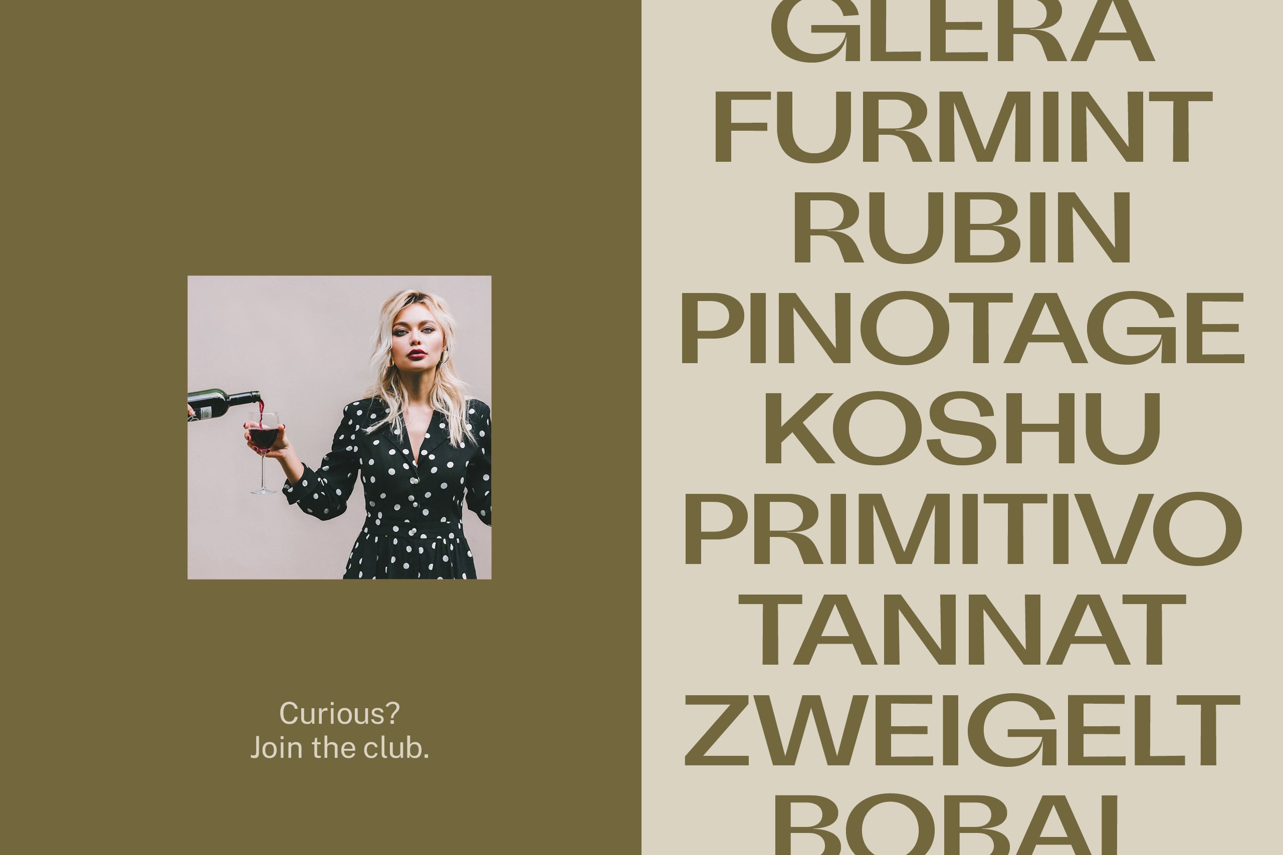
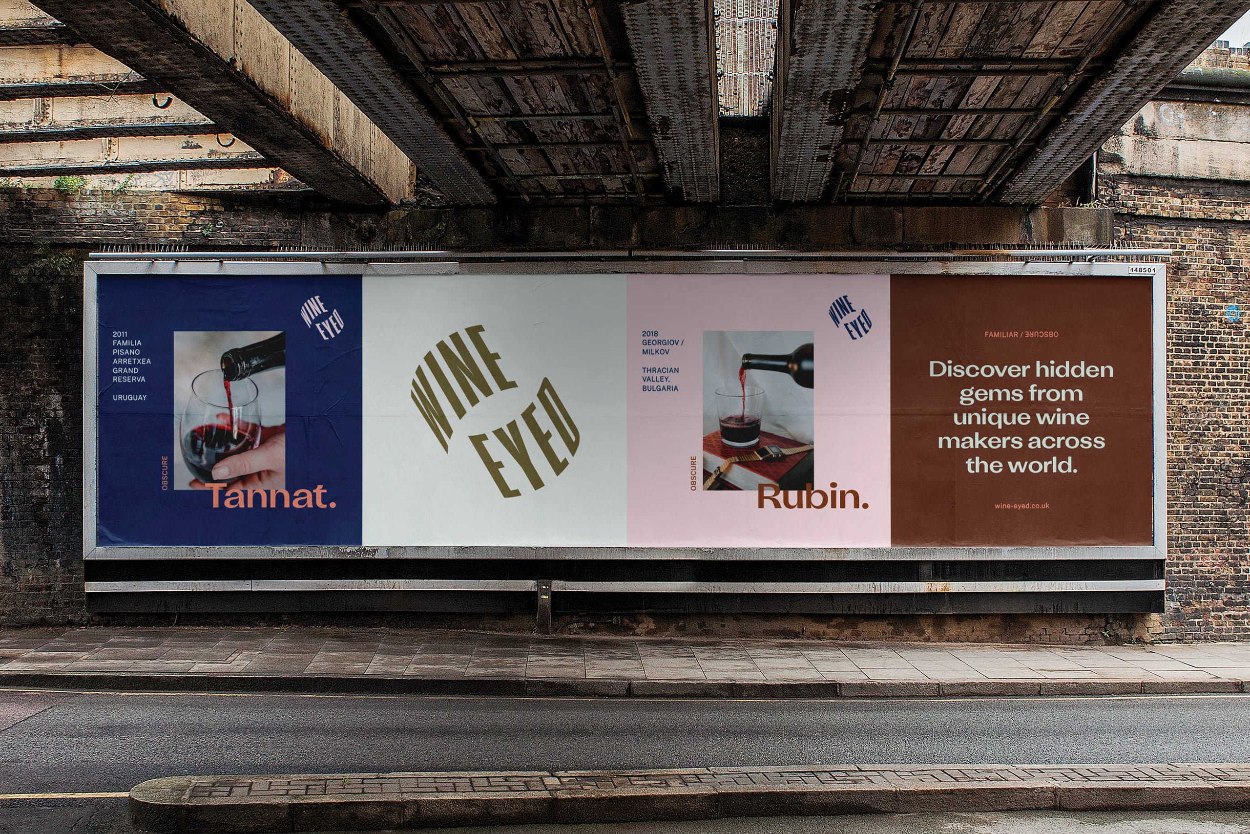
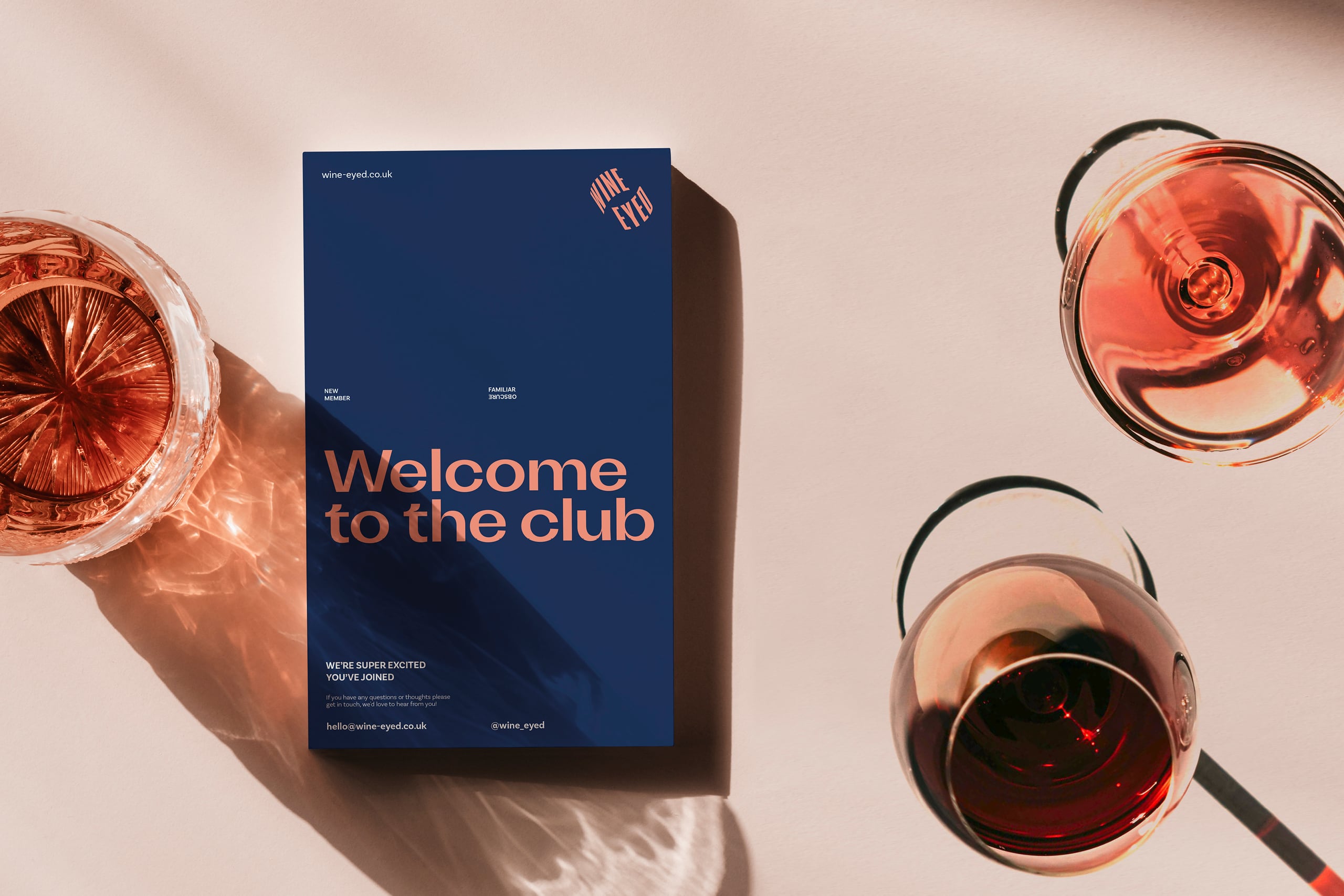
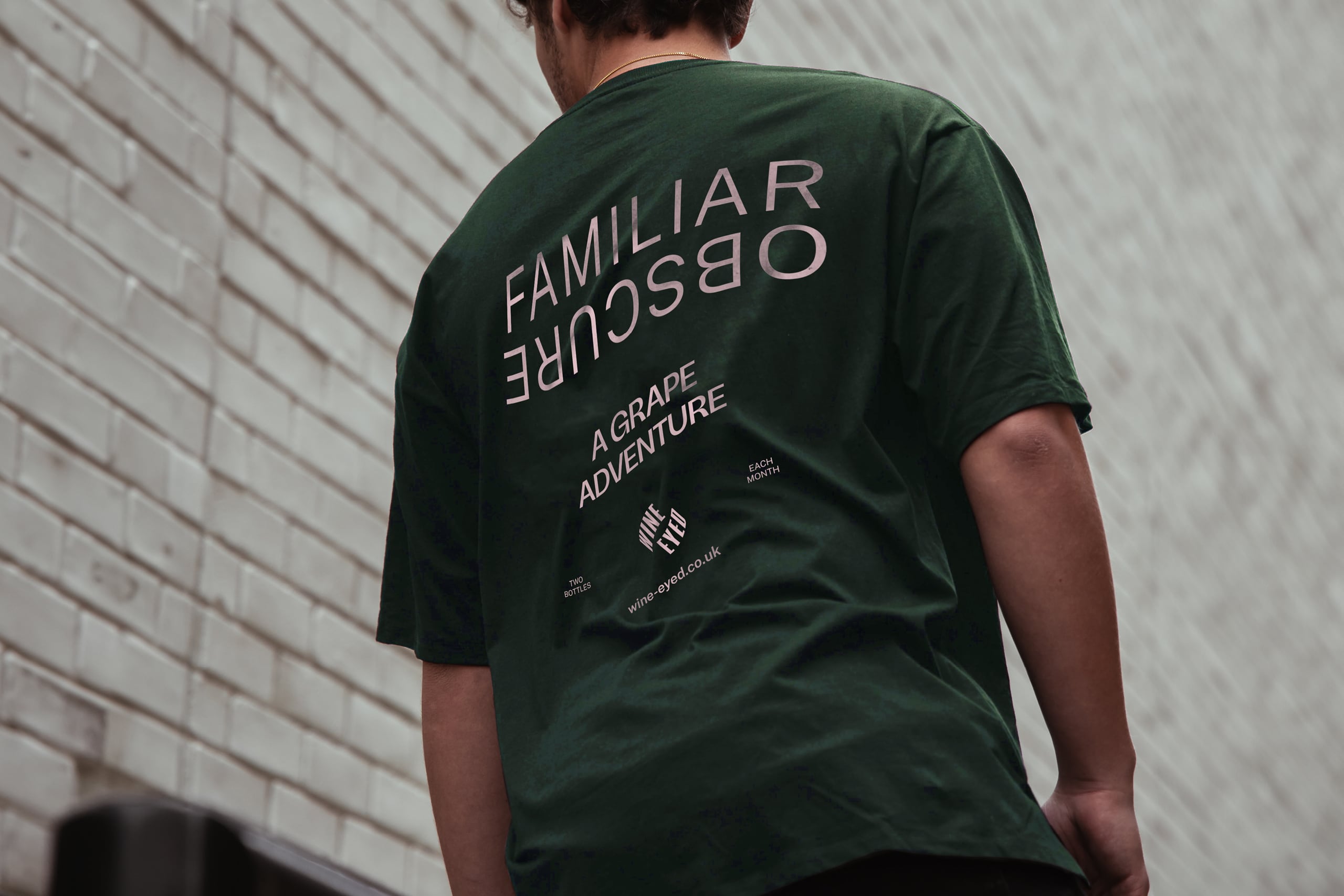
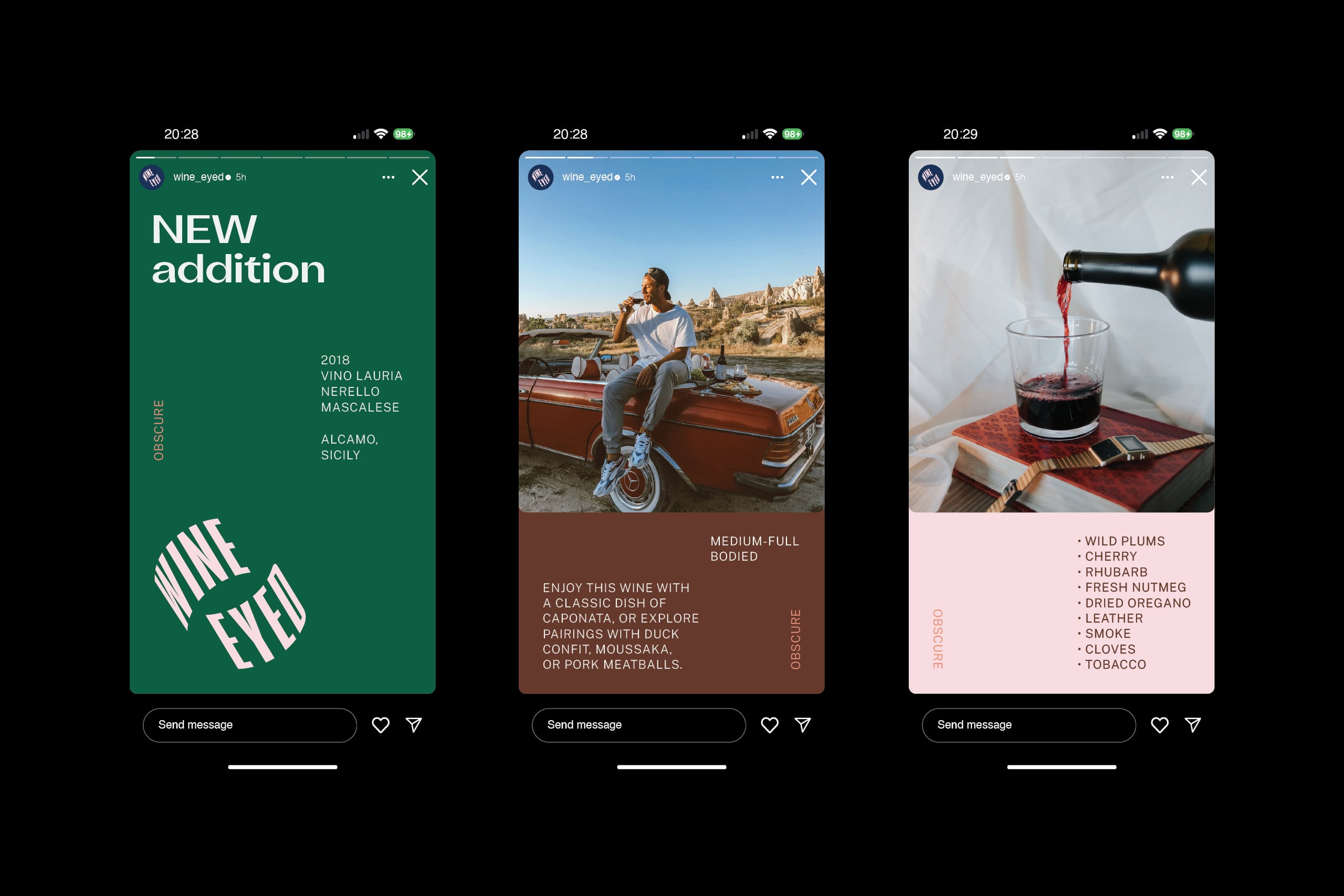
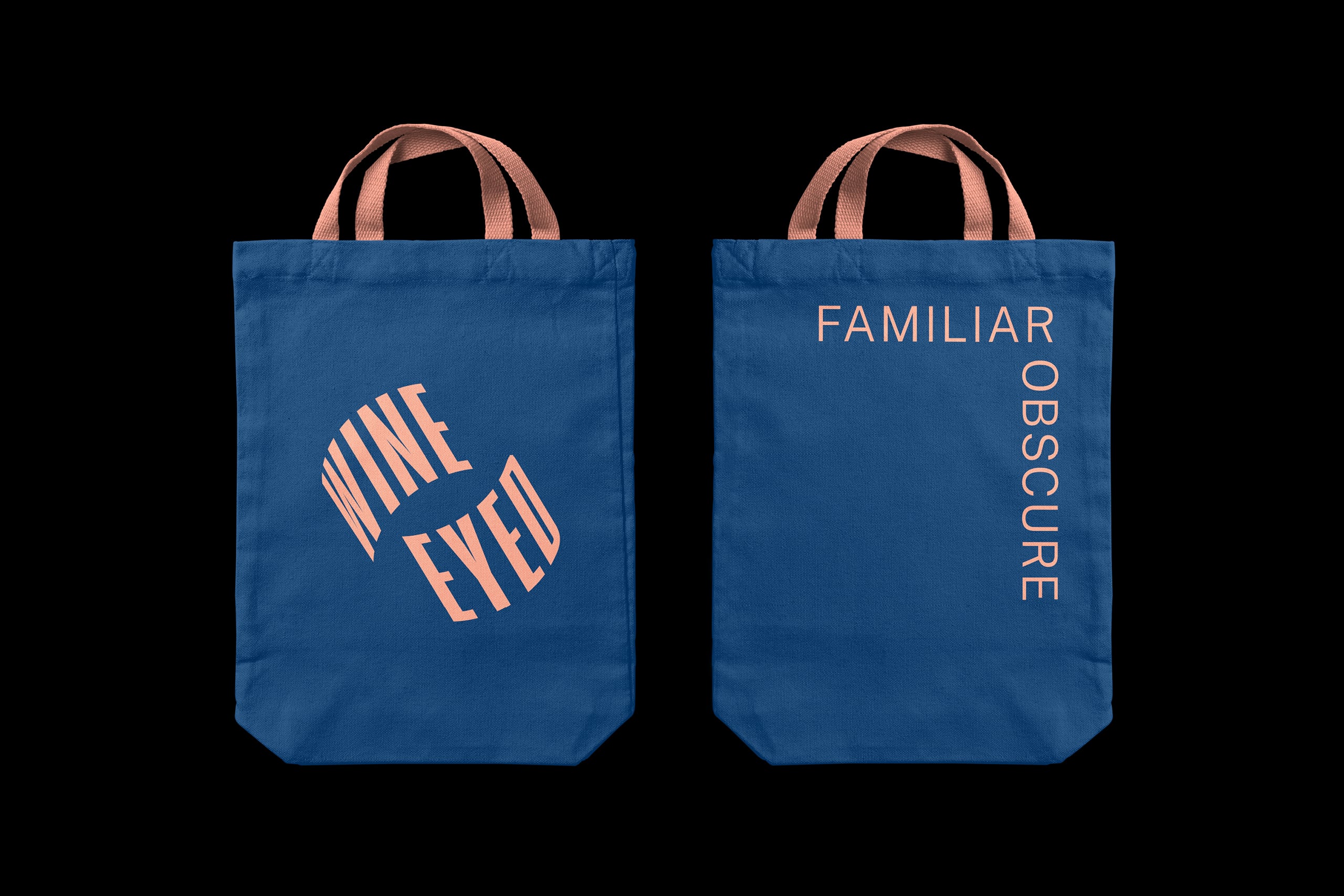
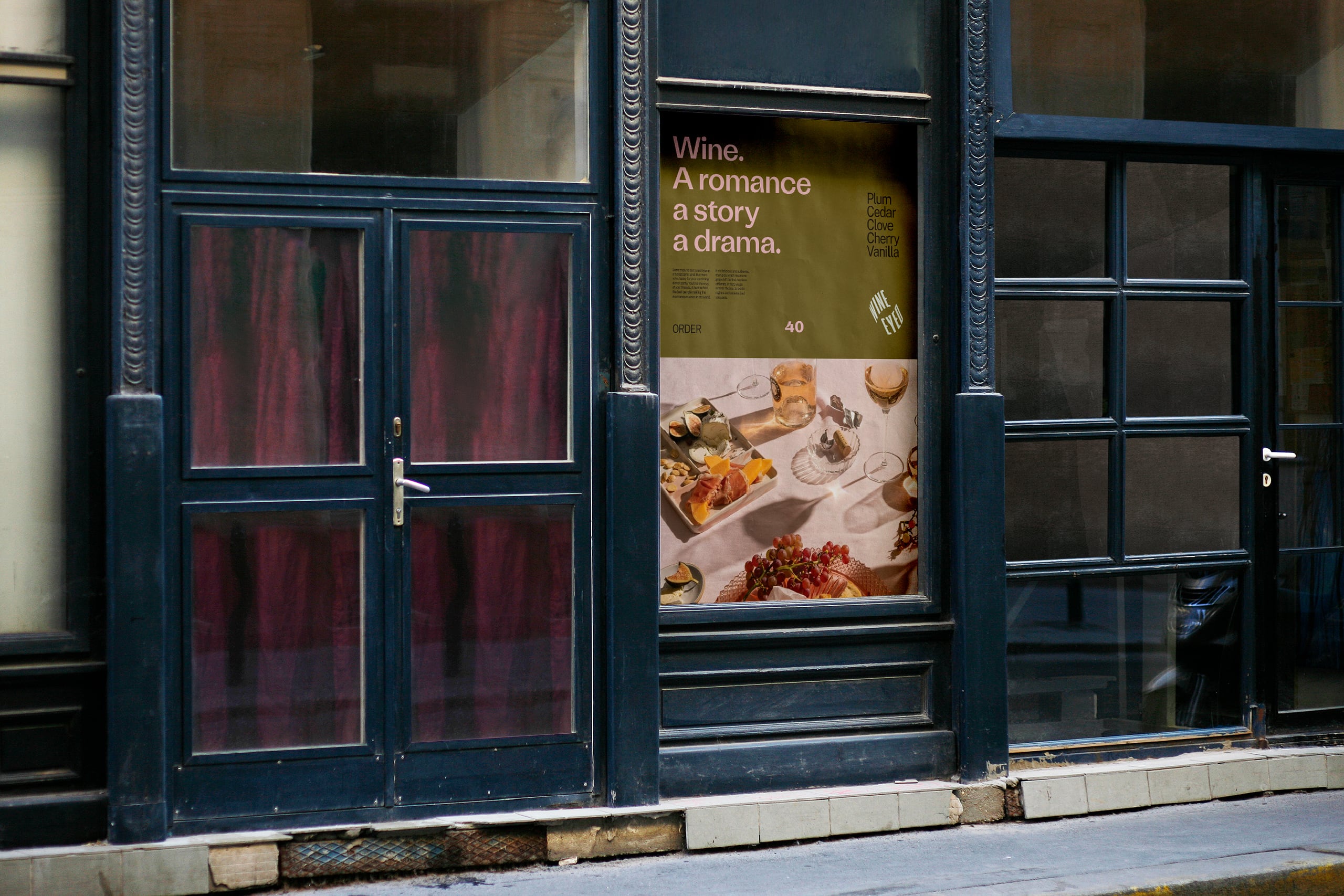
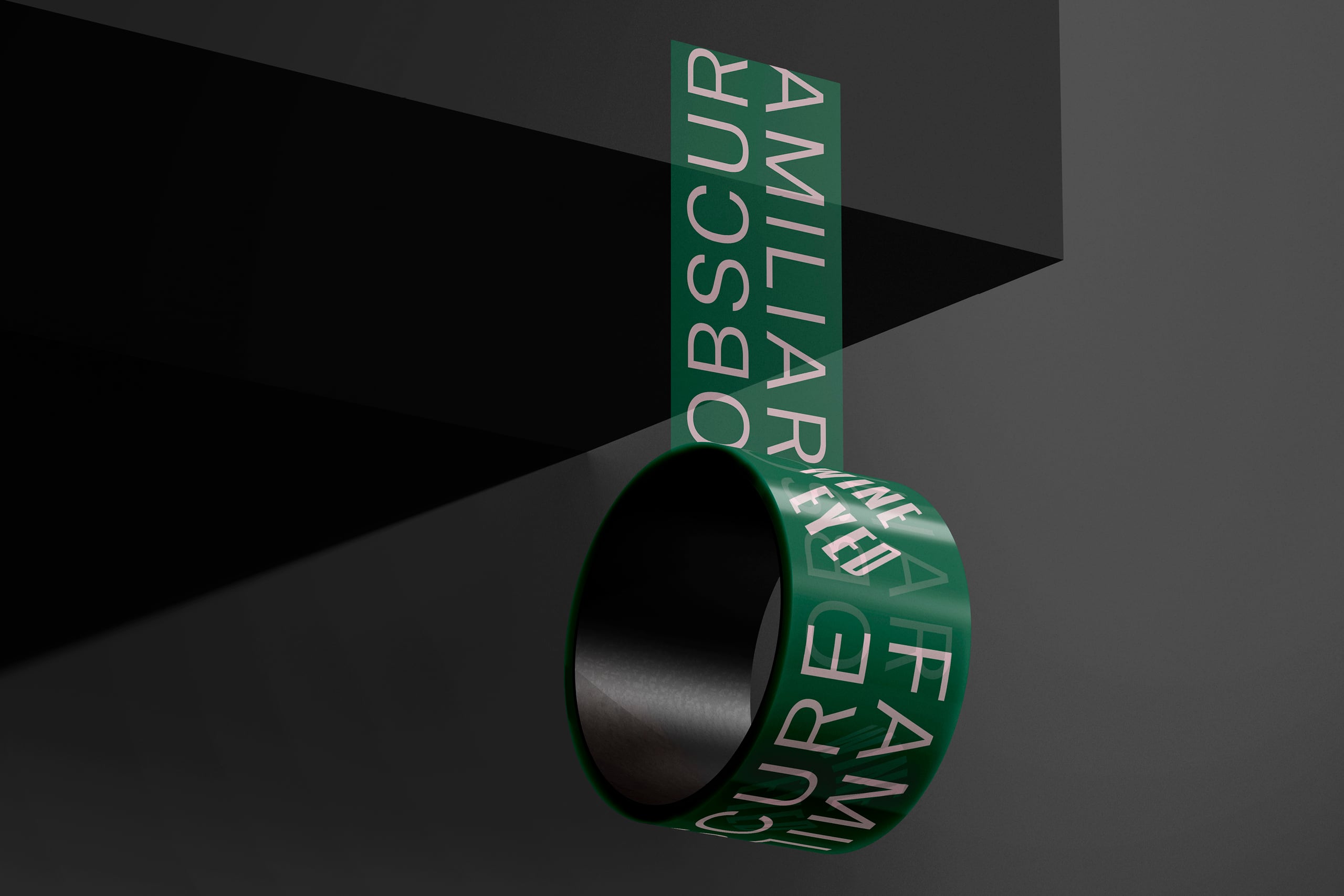
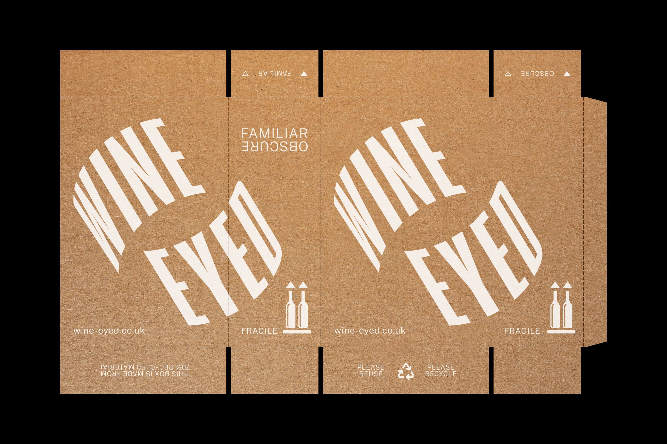
Brand strategy, identity, marketing communications and packaging for new challenger brand Wine Eyed, a wine club for the curious. Two bottles a month; one made from a FAMILIAR grape and one from an ƎꓤՈϽSꓭO grape.
Solution
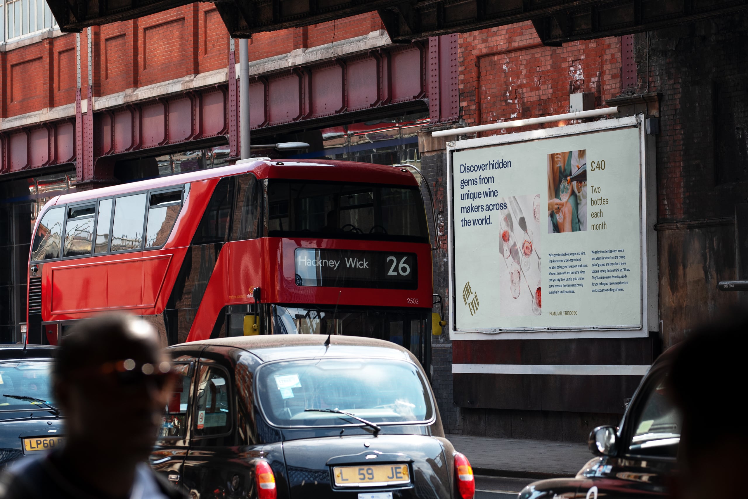
Of the 1368 grape varieties used to make the world’s wines, 65% of production is made from just twenty of these. Wine Eyed allows members to discover the obscure, unloved and under-appreciated grapes of the world, whilst championing the producers growing them (and helping to save them from extinction).
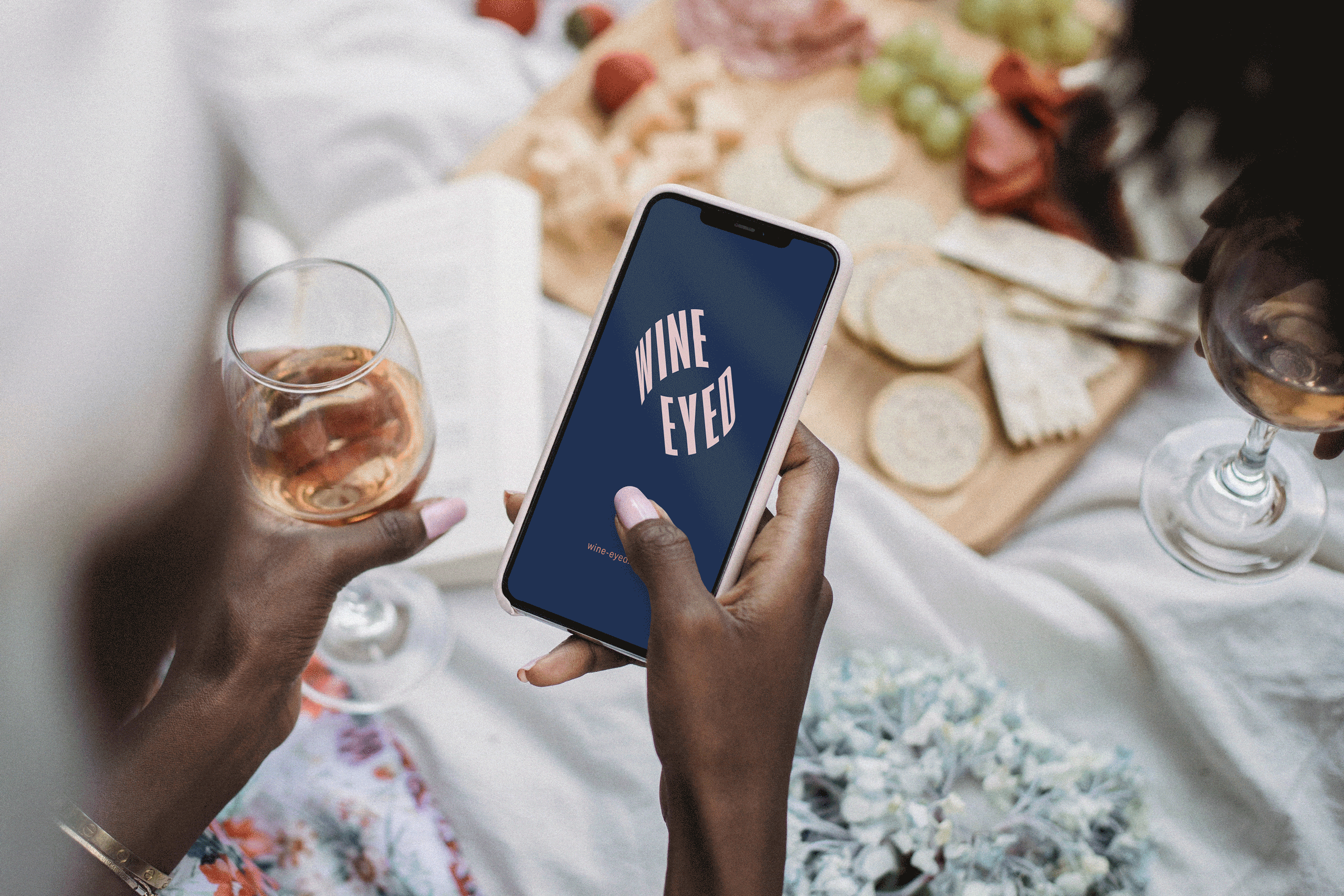
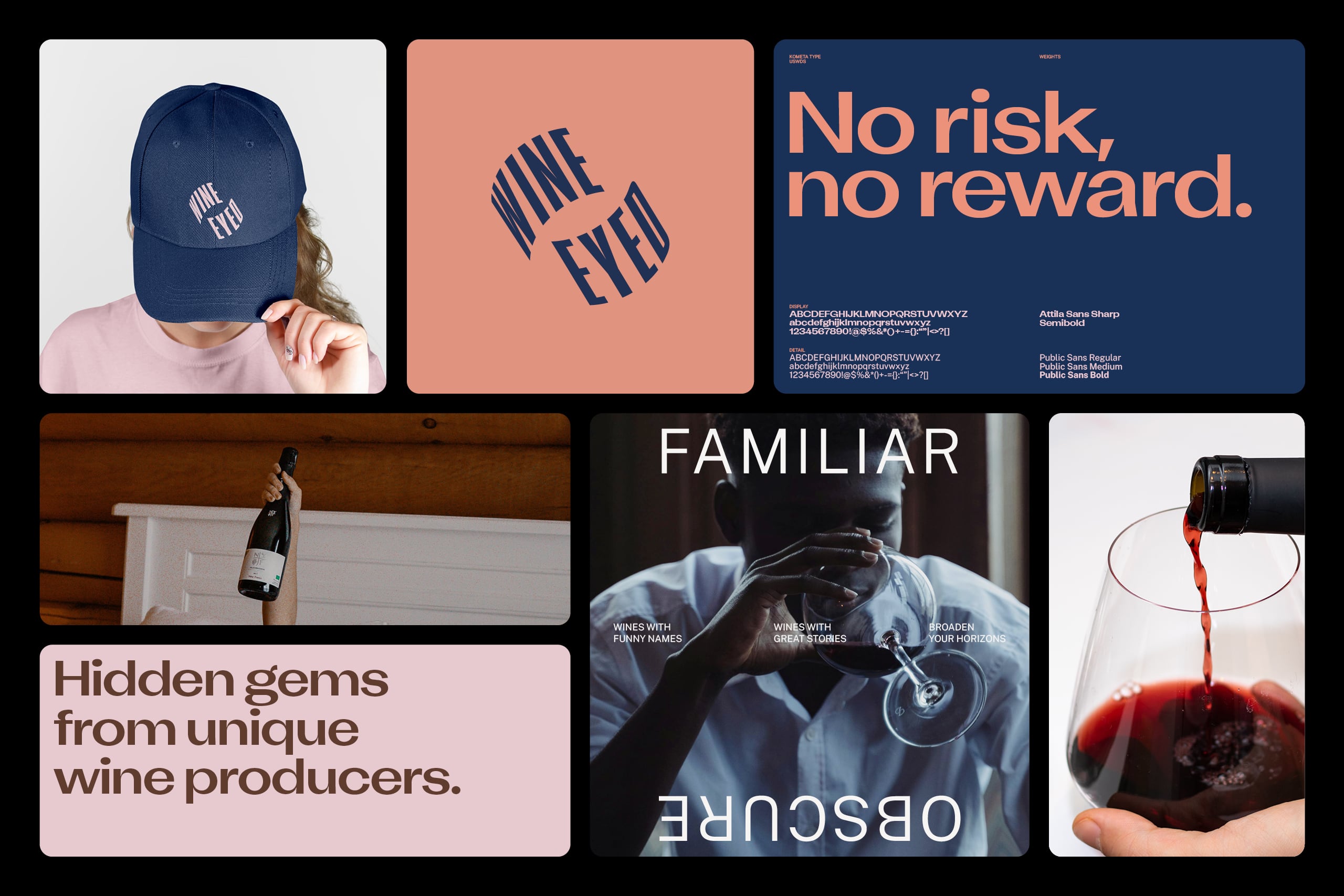
Our identity seeks to reinforce the concept of duality, and the experience of discovering something new and unfamiliar. The logo takes inspiration from wine labels, creating the illusion of being wrapped around both sides of a bottle. Colour references the natural wine-growing landscape, and is boldly applied in interesting and distinctive pairings. Sophisticated but slightly irreverent photography has an editorial tone which, along with a strong typographically-driven expression, confidently steers clear of the stuffy and inapproachable preconceptions of the wine world.
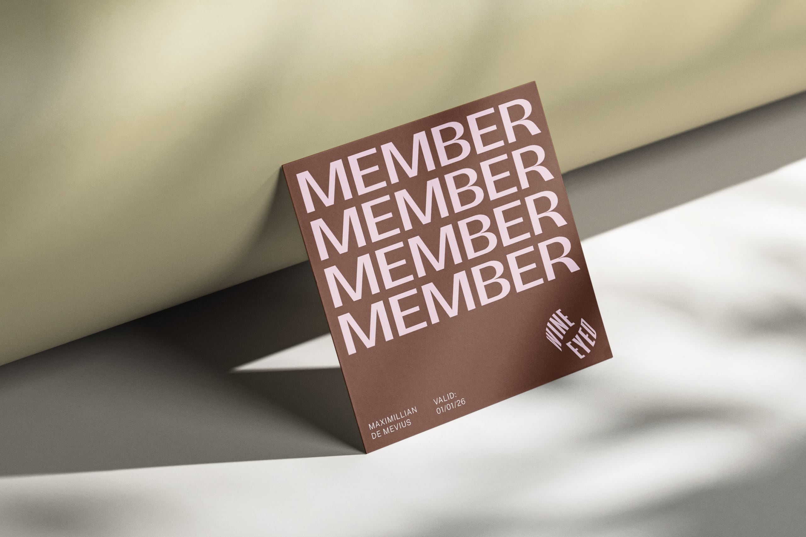
Members of the Wine Eyed club are adventurers: keen to take a chance on the unknown and broaden their horizons, expand their knowledge of wine, and share that experience with friends.
Disciplines
- Research
- Strategy
- Identity
- Copywriting
- Typography
- Packaging
- Marketing Comms
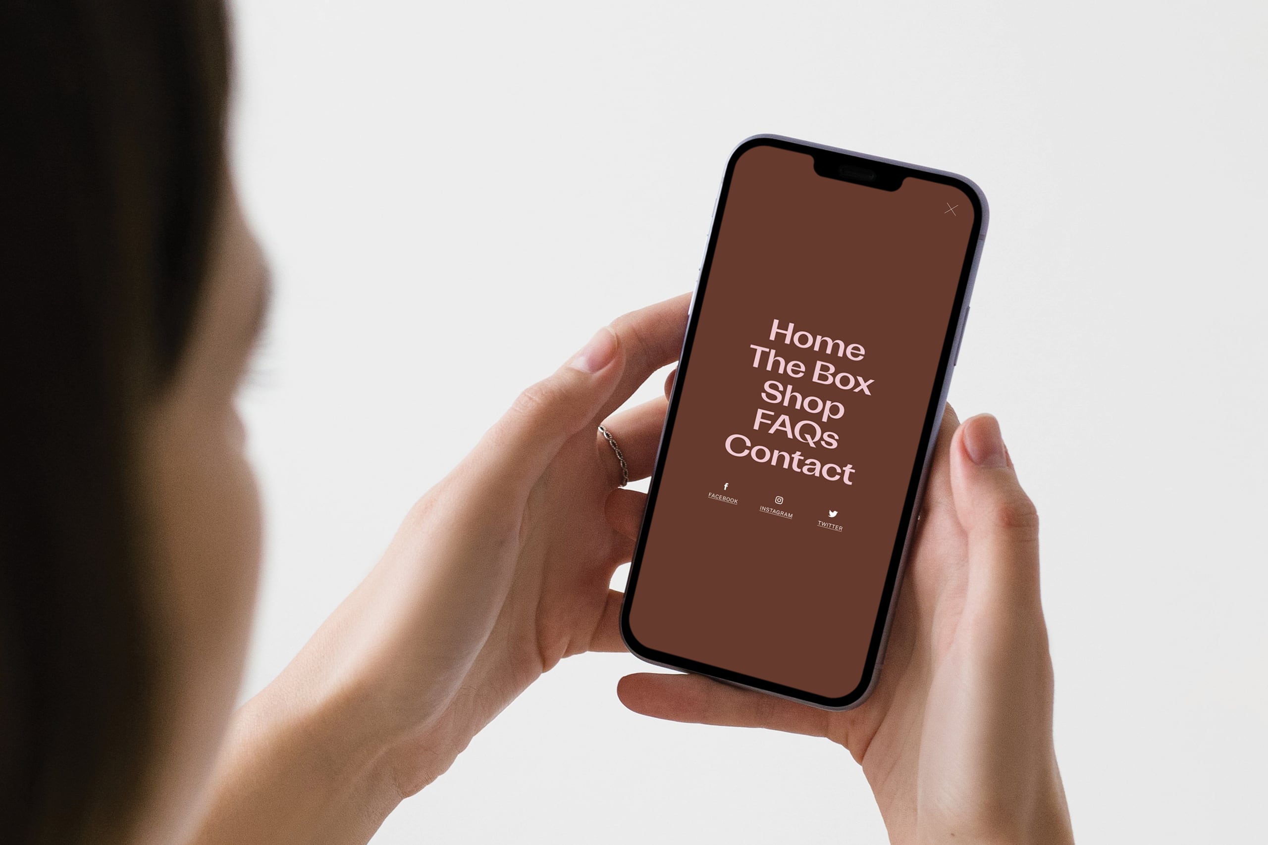
- Merchandise
- Advertising
- Digital Design
Project images